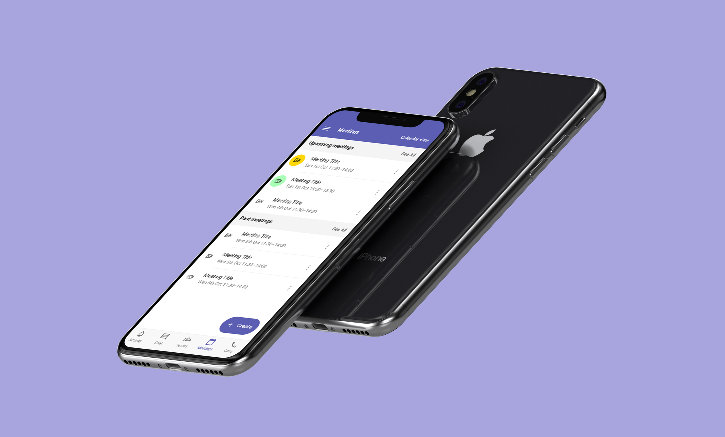

As part of the first module of my MSc. in UX Design, I was worked in a group of three to improve an aspect of the Microsoft Teams app. The project spanned four weeks (part-time) and comprised of research testing and prototyping.
Although we had never met in person, we worked well as a team. Meetings were used to share findings, discuss designs, and plan for work for our next meeting. We used Miro to share research and discoveries from testing and Figma to share and collaborate on prototypes. The early research we did to establish personas and user needs helping us empathise with users and gave us a shared vision, ensuring that we worked effectively as a group.
General frustrations experienced by students fell into six themes: exclusion and isolation, getting around, managing their schedule, empowerment, and accessing support.
Research methods included investigating online reviews and conducting interviews and more generative techniques such as user experience mapping and personas.
Since the widespread movement towards remote work, We saw an opportunity to appeal to new app users, focusing our research on people who had started using Teams since the pandemic.
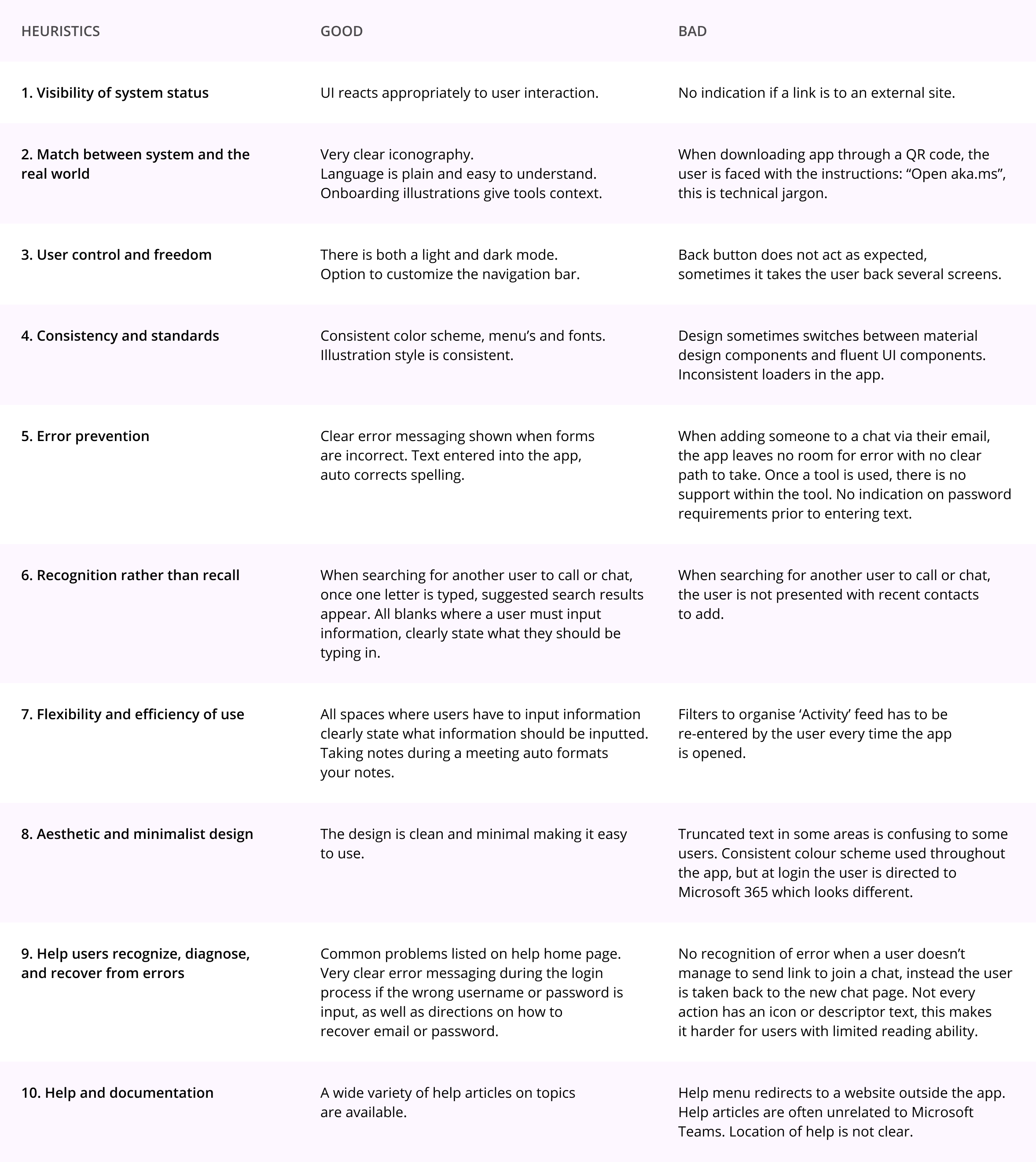
A heuristic evaluation was performed to identify issues in the app quickly. It became clear that two major pitfalls of the current design were accessing help and scheduling meetings.
Online reviews highlighted issues in scheduling meetings, app notifications, and the level of support offered within the app. Because of time and budget, ad-hock recruitment was used to recruit for interviews. Users I interviewed found the app difficult and unintuitive to use.
The personas embodied our research and sustained our empathy for the user—the two personas representing two novice Microsoft Teams users of varying computer literacy.
New users need a clear and straightforward way to schedule meetings — from inviting internal and external participants to editing and rescheduling. A solution should while ensuring the user is fully confident their meeting will take place on time and with the participants they invite.
Working fast limited personal attachment to our designs, allowing us to critique our work objectively. Initial ideas for improvement included:
Initially, the design was prototyped using paper to establish and refine core functionality. Digital wireframes were used to prototype and test the next itteration of the design.
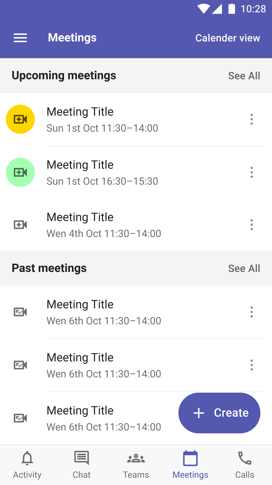
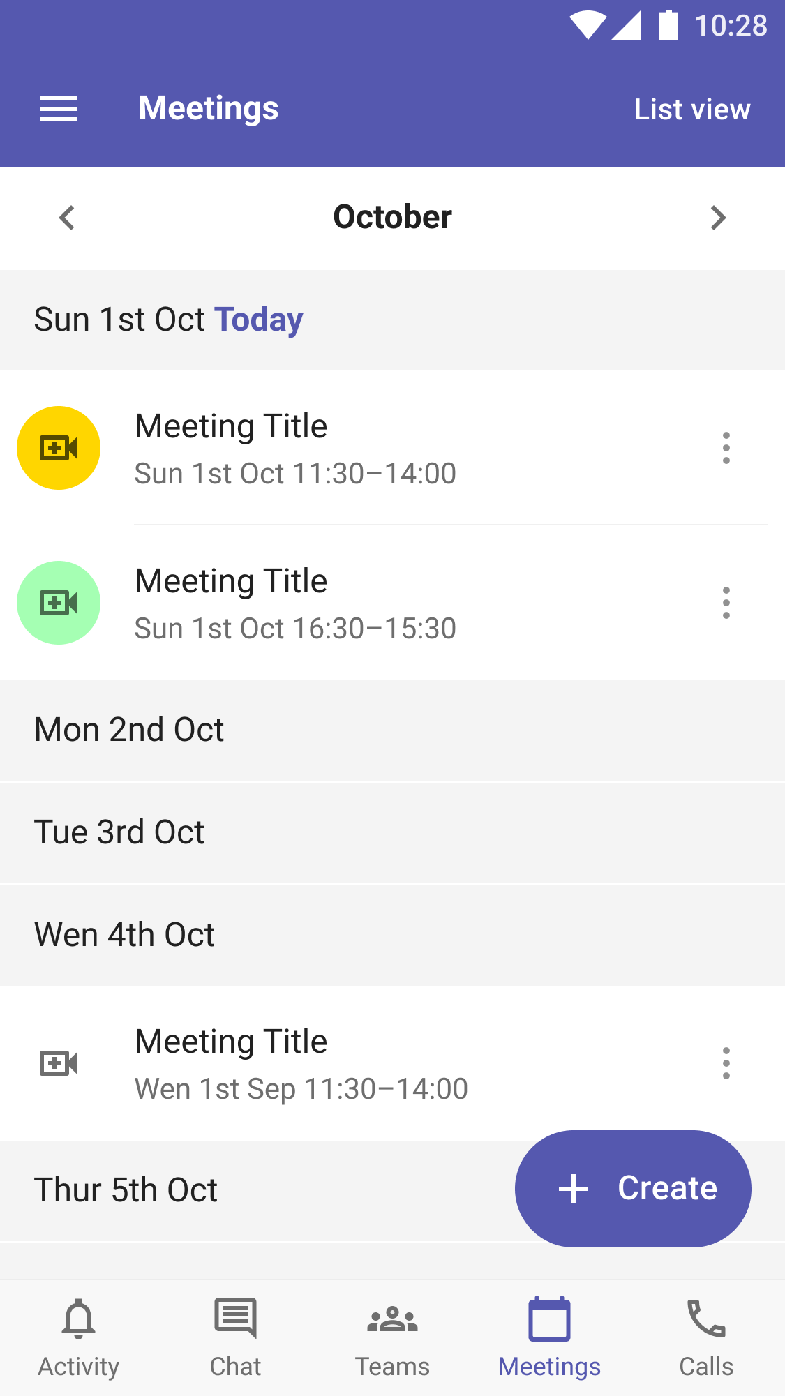
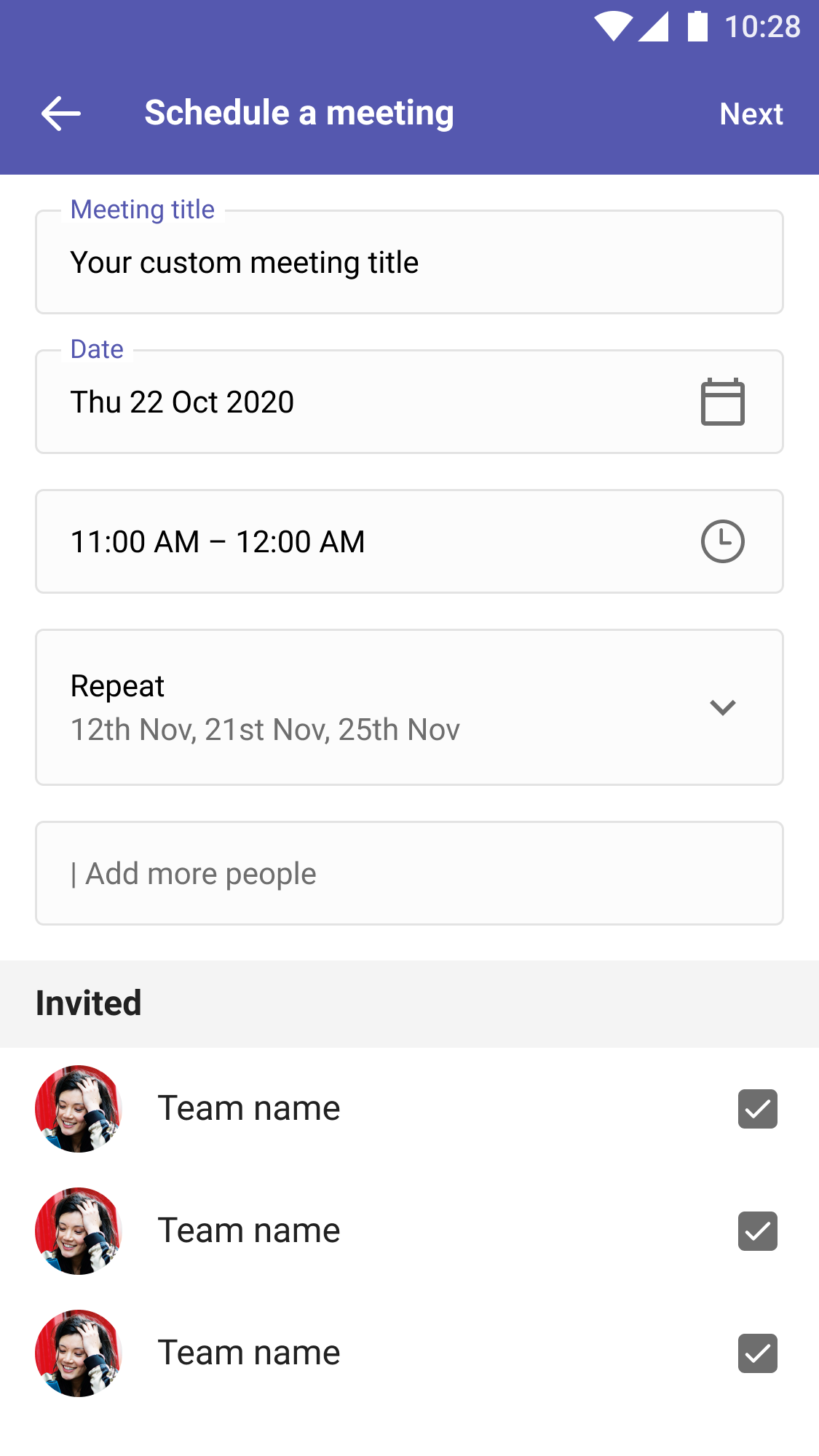
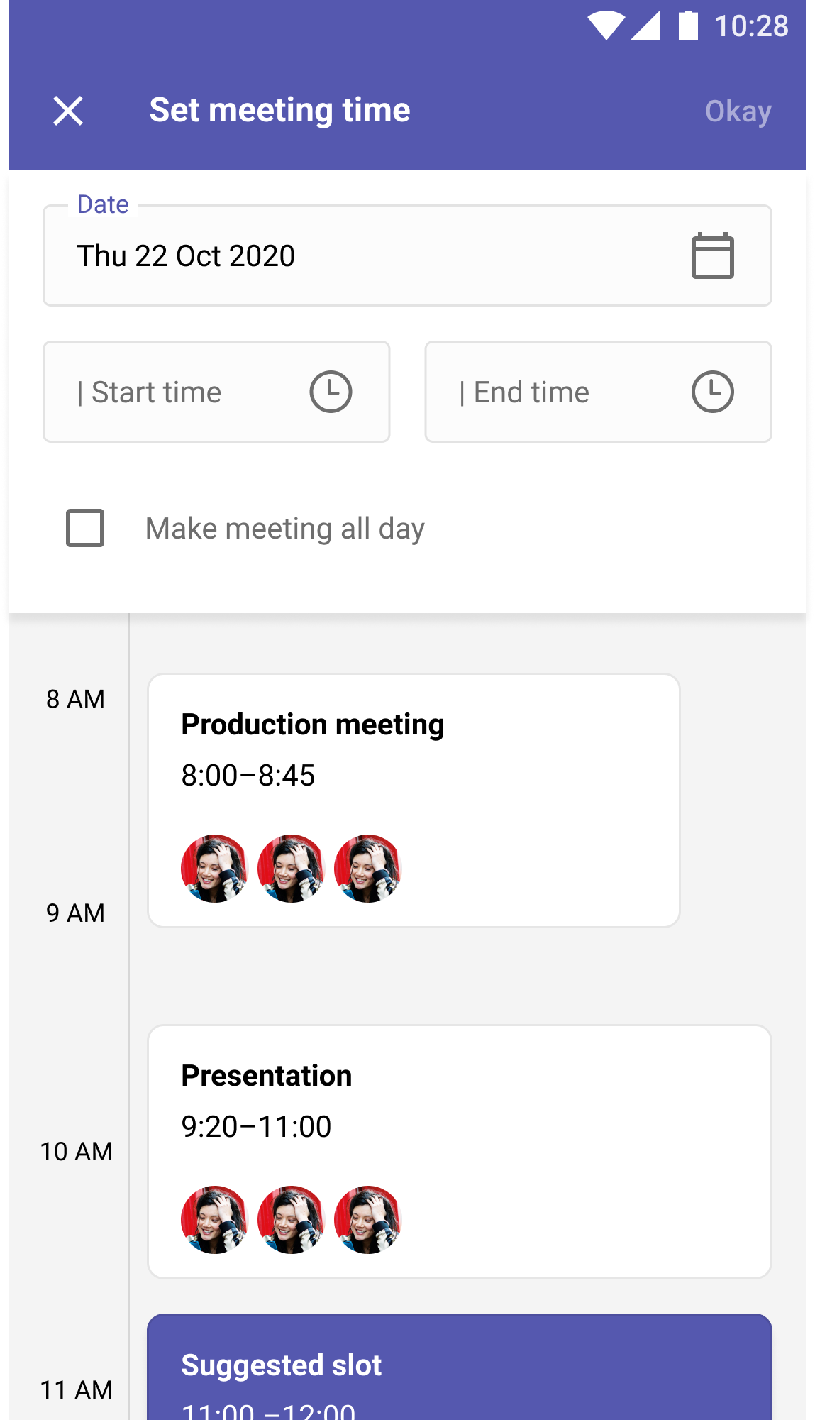
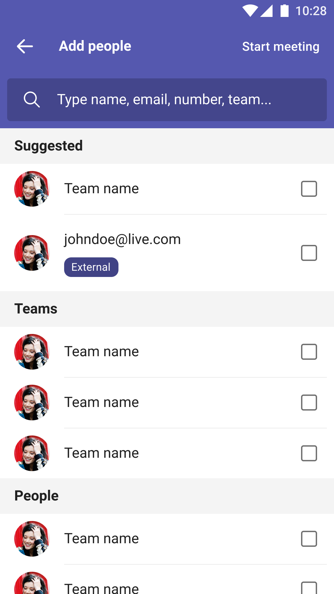
The design was made up of modular components, making it flexable and scaleable.
The speak aloud method was used during testing, and users were reassured that the prototype was not a final design, and not to worry if they got stuck, and to explain why they were having trouble. After testing, we asked participants for any closing comments or suggestions they may have had for the design.
User tasks were:
Reschedule a past meeting.
Customising an invitation.
Scheduling a meeting with their whole team.
Inviting additional people to an existing scheduled meeting.
Findings
Users were unsure whose calendar they were viewing when choosing a time for their meeting.
While searching for contacts to invite to their meeting, one user experienced uncertainty as to what would happen if they clicked a contacts name.
While browsing contacts to invite to a meeting, users were unsure whether clicking a contacts name would invite them or open a biography page.
Users felt trapped and unsure of what to do whenever there was lacking a clear call to action.