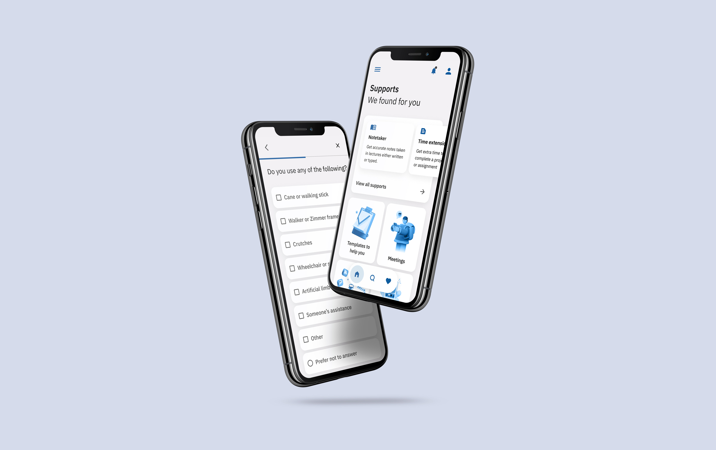

As part of the fourth module of my MSc in UX Design, I designed a new product for third level students with disabilities using universal design principles. The project spanned four weeks (part-time) and comprised primary research, prototyping, and user testing.
Because I was tasked with innovating a completely new product, research was critical. Methods included a call with support services from IADT, interviews with current and past students, reviewing a day in life youtube videos and online articles on disabled students experiences in university.
General frustrations experienced by students fell into six themes: exclusion and isolation, getting around, managing their schedule, empowerment, and accessing support.
General frustrations experienced by students fell into six themes: exclusion and isolation, getting around, managing their schedule, empowerment, and accessing support.
I created three personas that captured edge cases and common users. Considering edge case users ensured that the app would work for a larger number of students.
A few potential product ideas came out of the research to help all students, not just those with disabilities.
Society matcher
Match students with societies that they might enjoy.
Routeplanner and schedule
Help students make it to class, from managing their schedule to suggesting routes around campus or public transport.
1st year matters support
Raise awareness of supports available and how they can help students.
Issue reporting app
Report blockers and inaccessible infrastructure of barriers around campus and get them fixed.
Quick needs assessment app
Check what supports you might be eligible for and how they might help you.
The research made it clear that one of the largest problems was the people who need support but never had a needs assessment or didn't understand how support could help them.
I narrowed my focus to designing a product to check how support could help them conveniently. From the point of view of the college and supports staff, if they were able to know the number of disabled students and what kinds of supports they required, the college could apply for funding to put in place suitable infrastructure in anticipation of student needs.
To prototype the app, I needed to find a way of screening for disabilities that already existed and could be done remotely and unmoderated.
The Wahington learning needs screening tool was used to screen students for the likelihood that they have a disability and would be eligible for learning supports.
Central to the product is that it would alleviate students' burden of seeking out and securing supports.
The app is fairly linear. The home screen acts as a springboard from where users can delve into different functions. This creates forward and back navigation that is simple and straightforward.
The design went through 3 iterations. Changes to the design were in response to findings in user testing. Throughout the design, iterations the architecture of the app remained much the same.
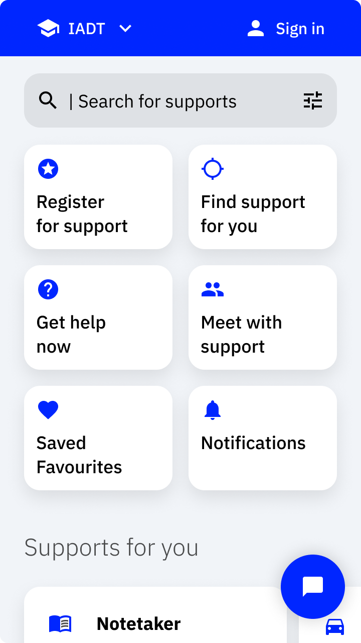
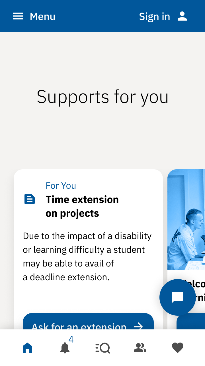
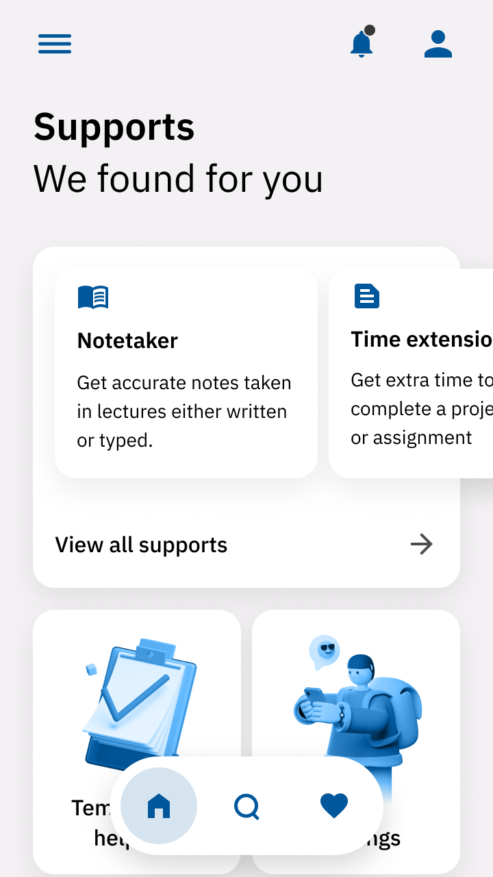
The visual language is friendly, reassuring, simple to understand and accessible. These characteristics appeal to a diverse set of students, from cognitive disabilities to colour-blindness, to those with visual impairments.
The tone of voice is calming and measuring, whilst also reflecting some language that younger users may use.

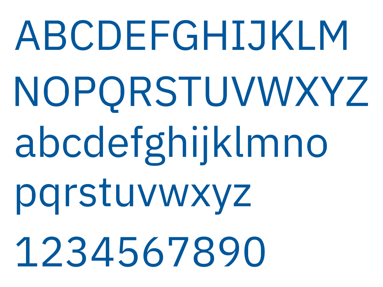
IBM Plex Sans is used as it is modern, accessible, and open source. Features that increase its accessibility include:
Double story lowercase characters.
Extra details on letters a, g, l and I make the characters more distinct and prevent confusion in users.
The colour scheme is minimal and accessible. The choice of colour was to ensure clarity and accessibility for colour-blind users.

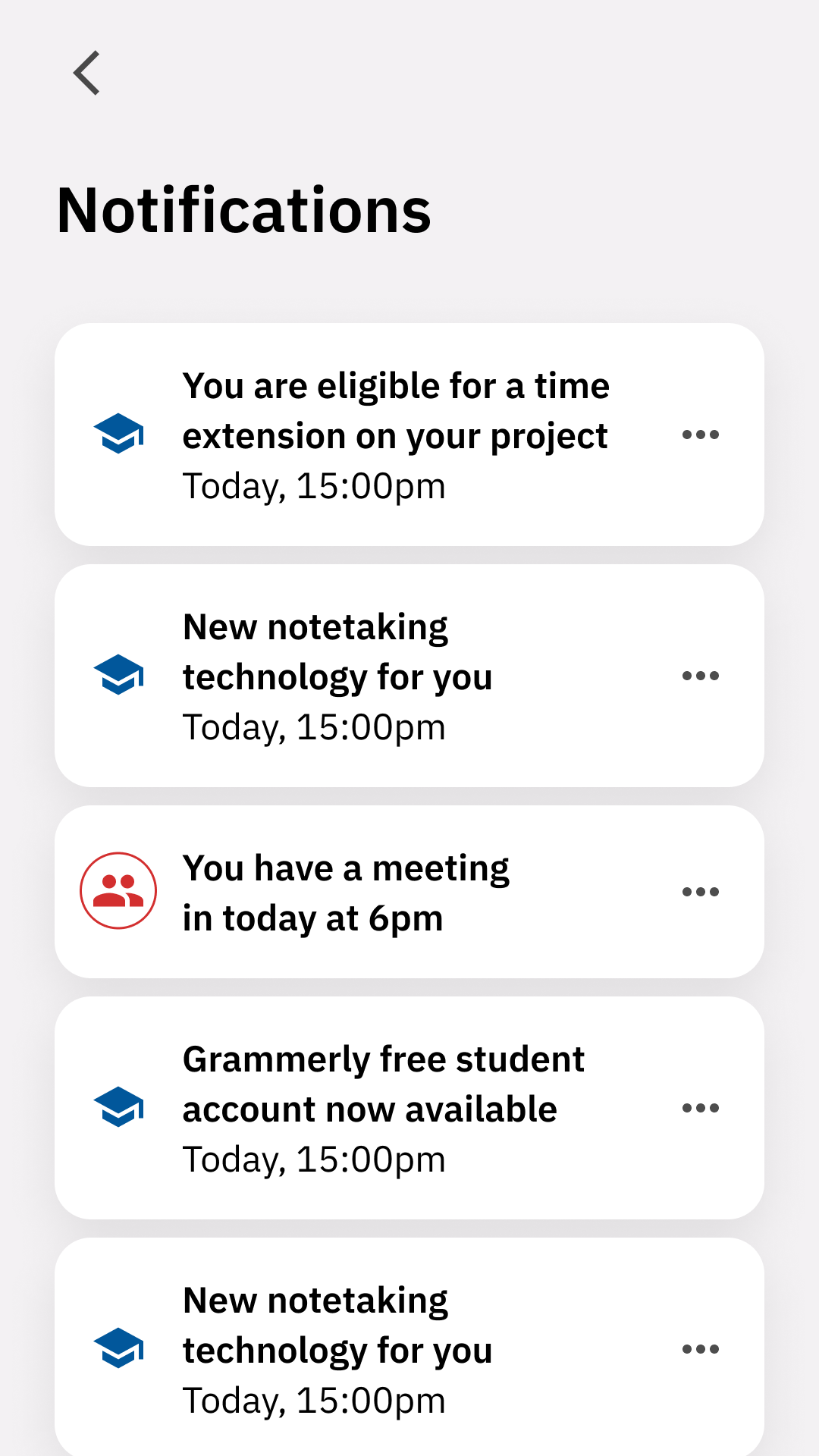
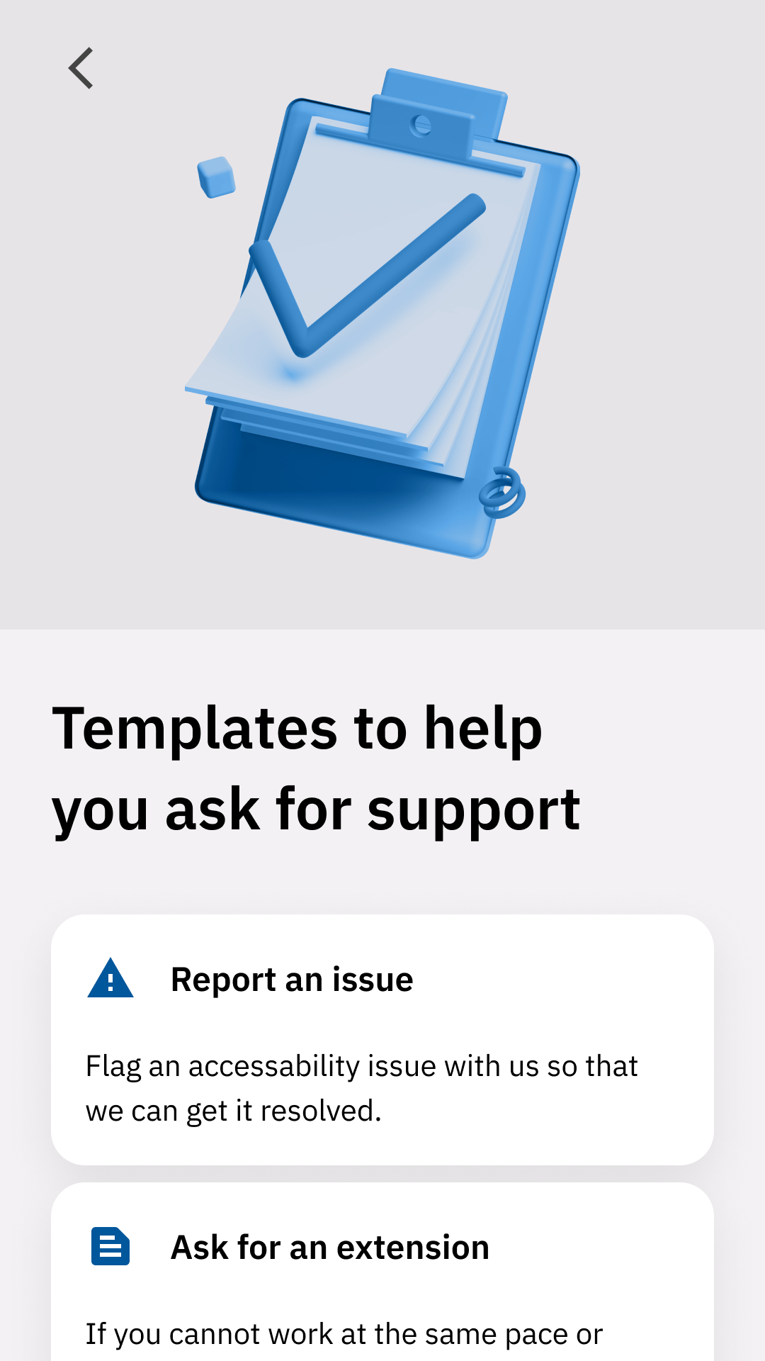
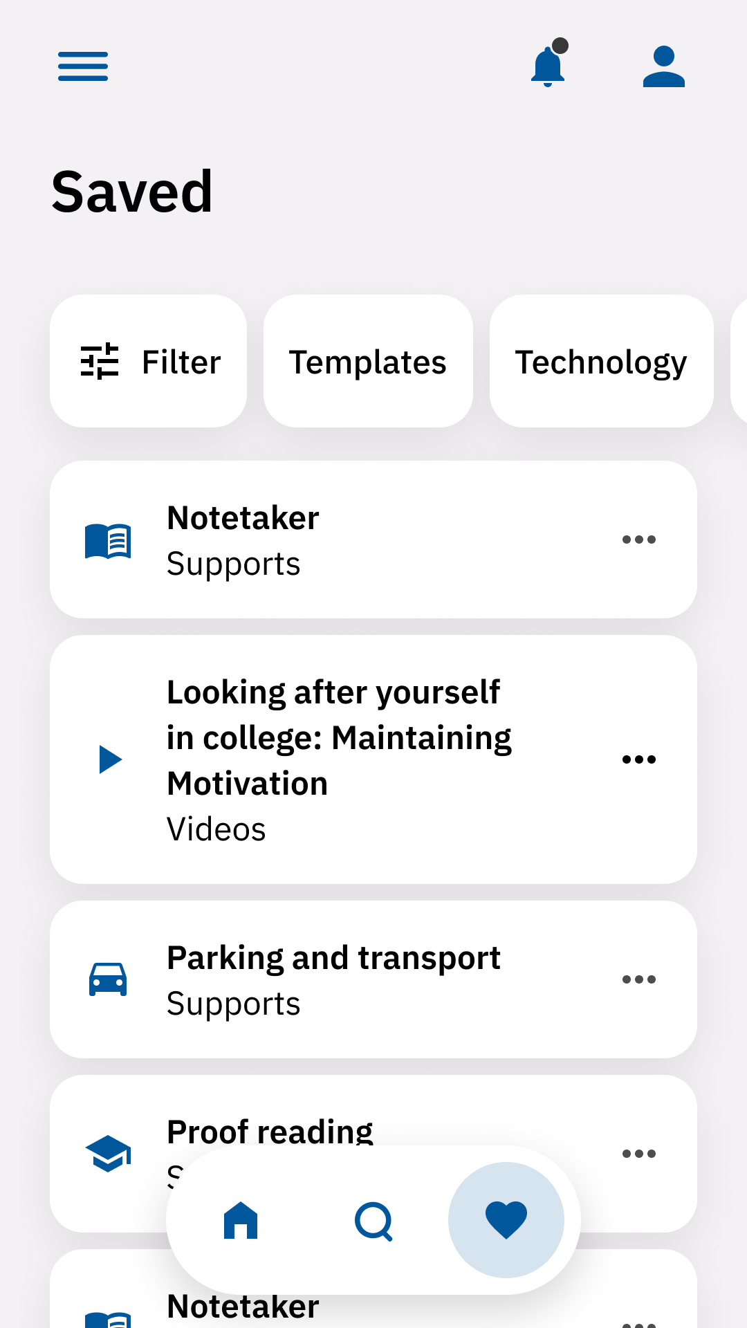
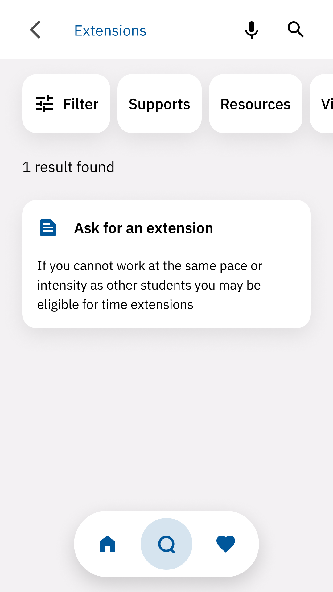
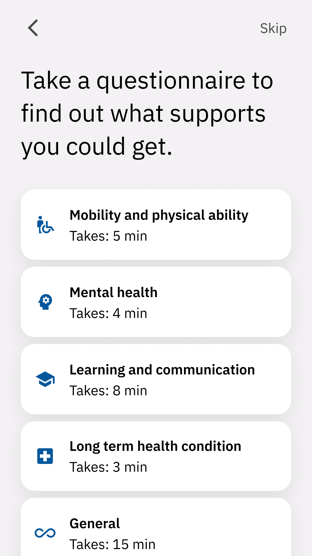
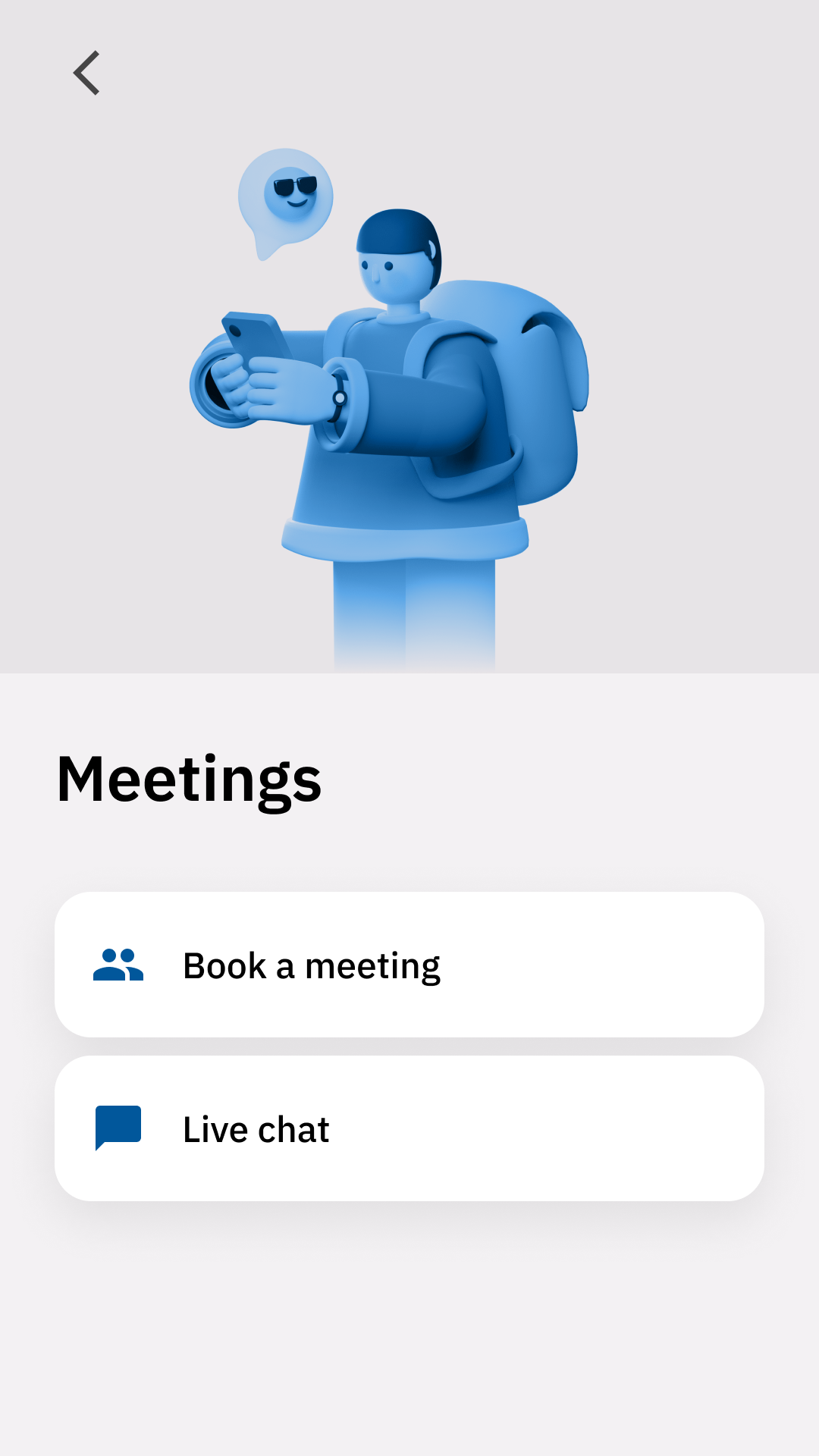
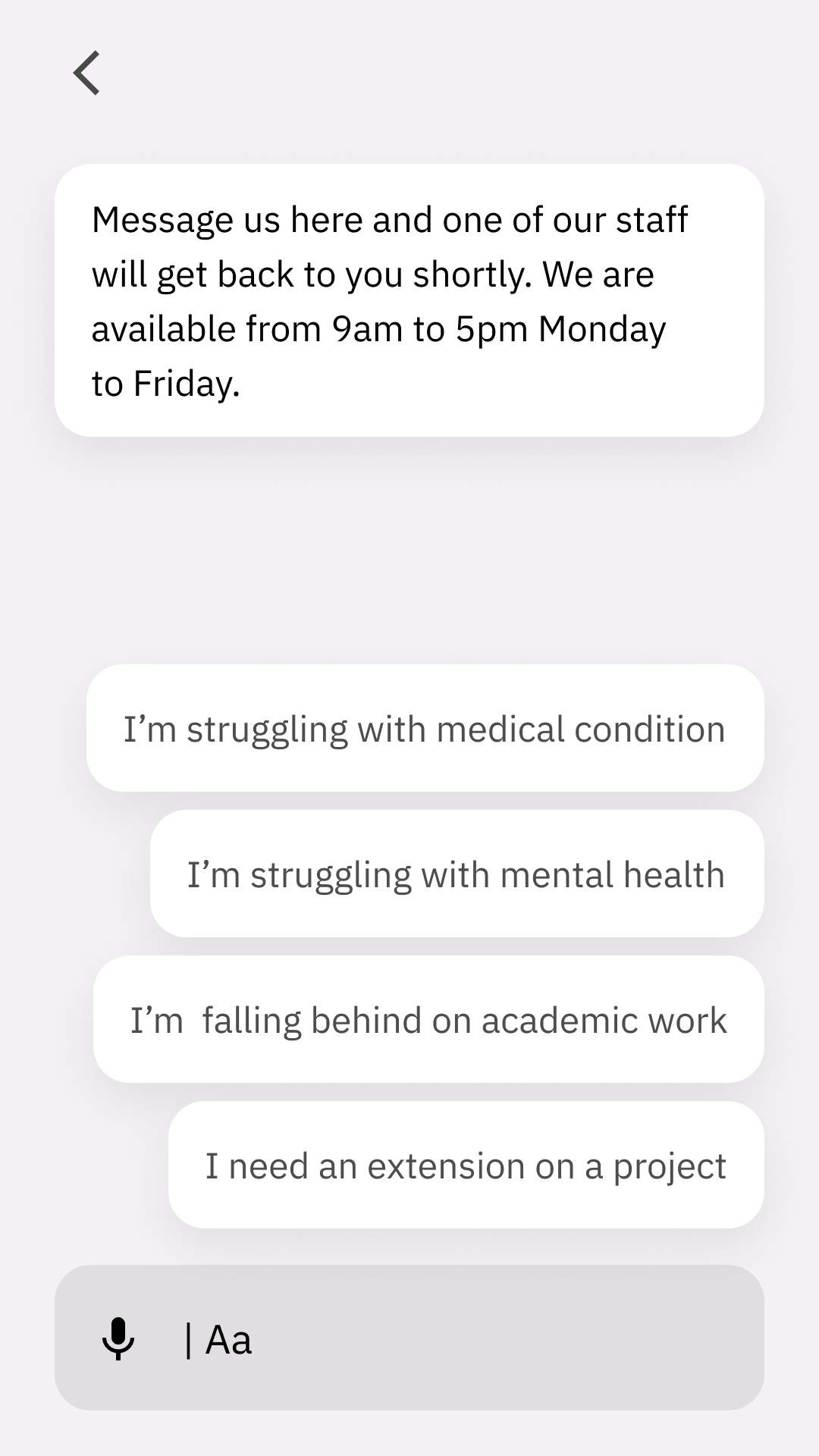
The design was made up of modular components, making it flexable and scaleable.
The product went through three rounds of testing. Each test was moderated and conducted over Zoom—tests were recorded with participants' permission for notation later.
Testing order:
Read out adapted Steve Krug participant test script.
Background questionnaire to categorise the participant.
Asked participants to complete tasks one by one.
Asked participants to fill out a system usability questionnaire to generate a SUS score.
User tasks
Find out what supports you are eligible for.
Book a meeting with support.
Contact college support.
Get help to ask for an extension on a project
Testing results
In total, there were five tests conducted. Rounds of testing and iteration lead to a smoother, better-designed app, as issues became flagged and were resolved in theGet help to ask for an extension on a project.
System usability score
81/100