As part of the fifth module of my MSc. in UX Design I tasked with redesigning a app of my choice, using persuasive design. The app I redesigned was the asos ios mobile app. The redesign utilised social proof, bahavioural economics, and gamifiction to design an app to boost user engagement and transsform Asos from a shopping app to a social e-commerce app. The project spanned two weeks (part time) and comprised of desk research and UI design.
The goal of the redesign was to encourage users to buy more products and spend more money on the app. To achieve this, I used persuasive design principles from Robert Cialdini and Nik Eyal to increase and manipulate user behaviour to meet the business goal to increased revenue. Persuasive design principles featured in the design included:
Social Proof
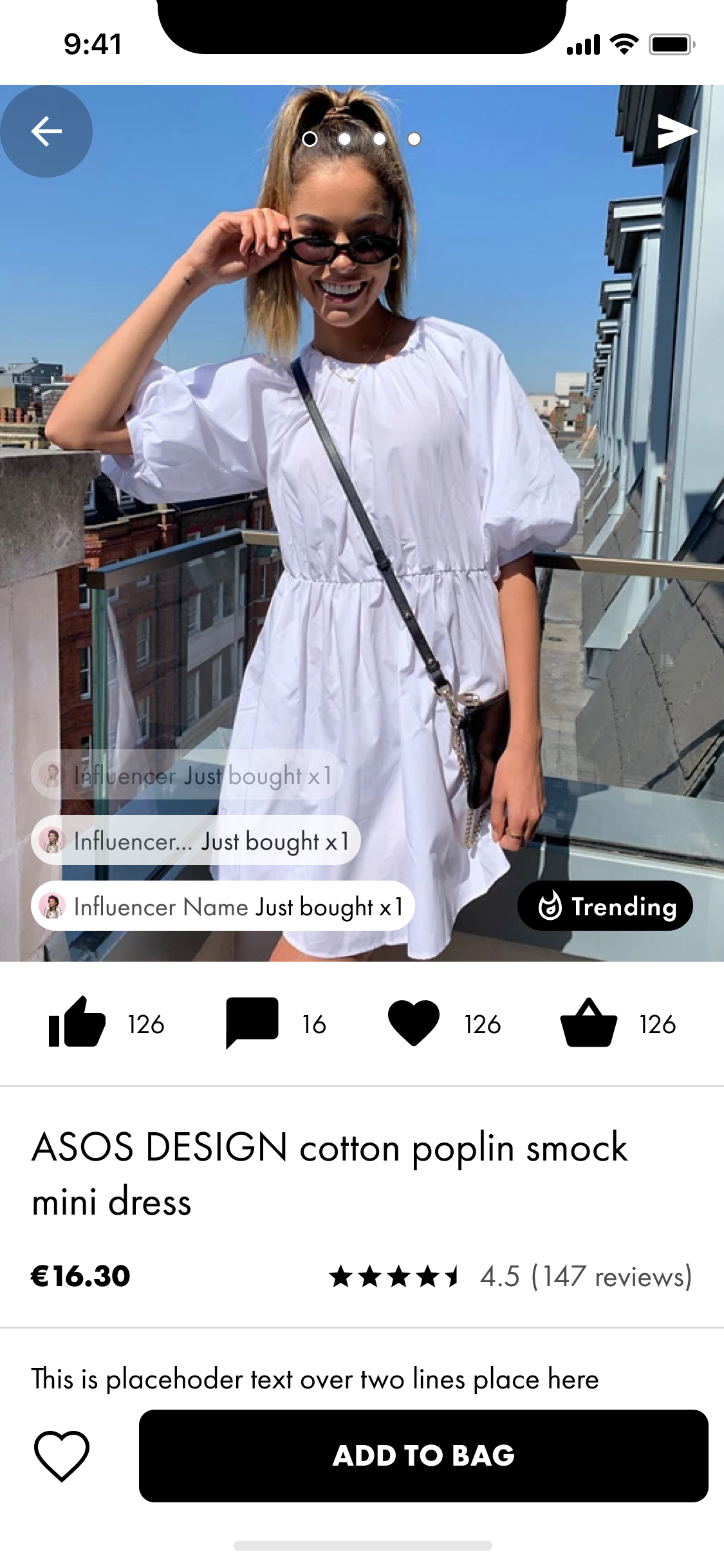
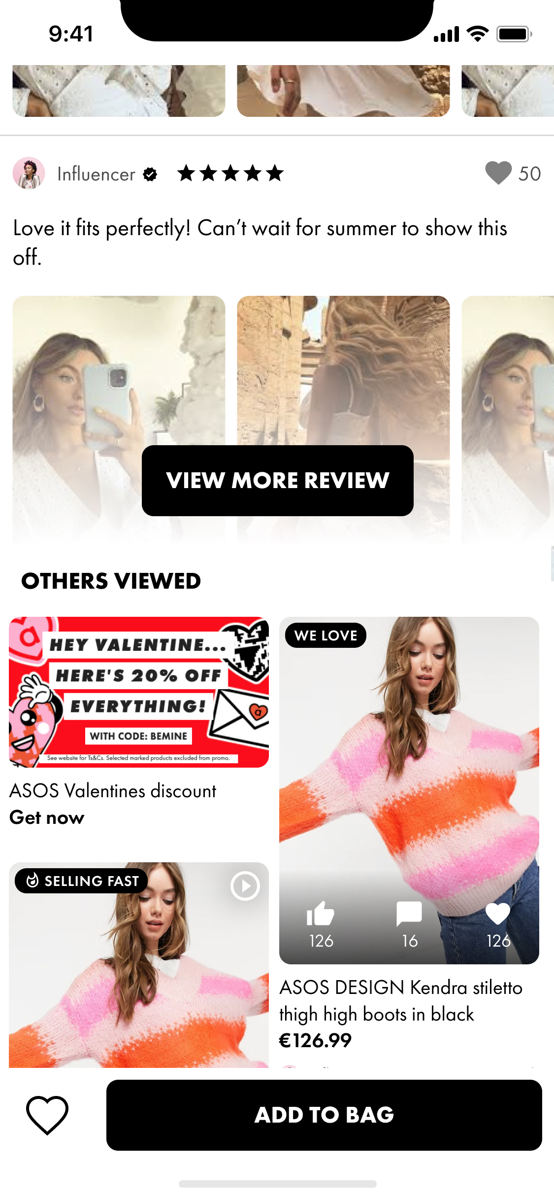
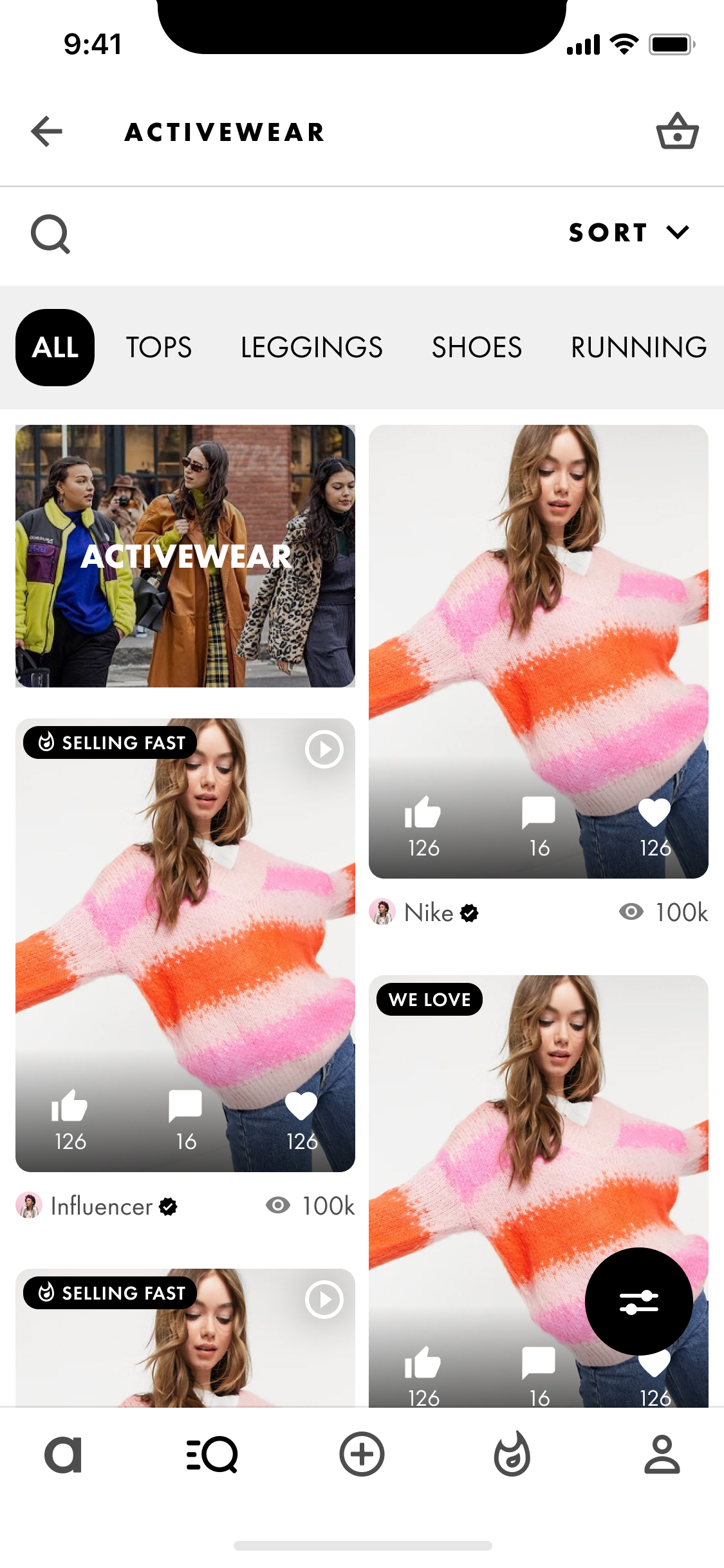
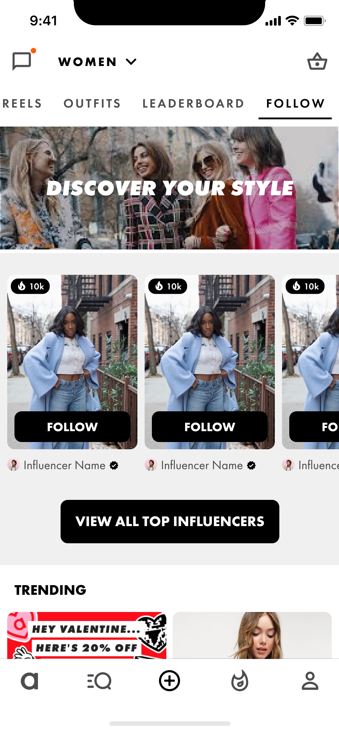
Seeing the activity of others on the app, what they are saying, doing, buying and saving all influences users in what actions to take. Generally, people follow the herd.
Scarcity
Limiting or signalling low stocks of particular items can encourage users to purchase them for fear of missing out.
Authority
Journalists and Influencers sway people's opinions and actions as they follow the words and actions of those they view as experts.
Gamification
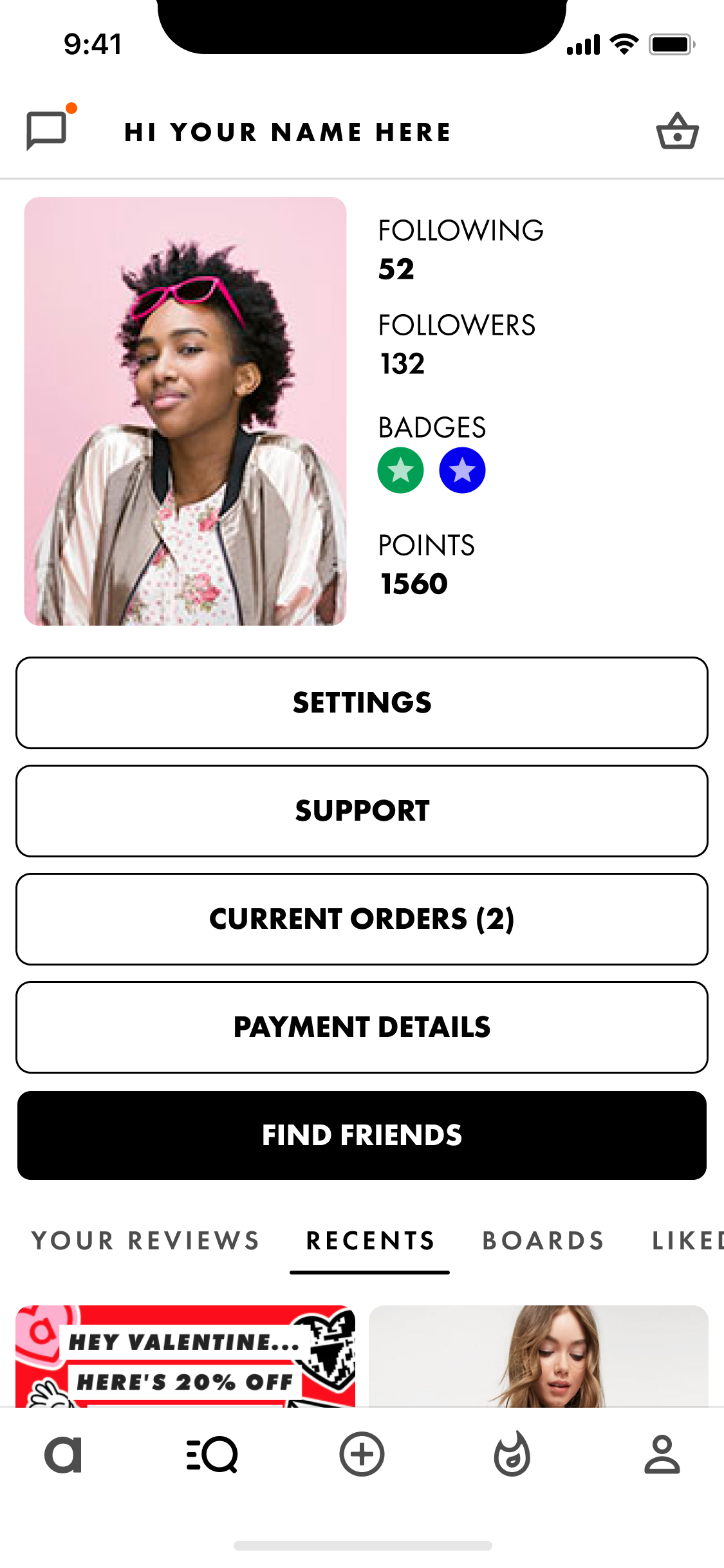
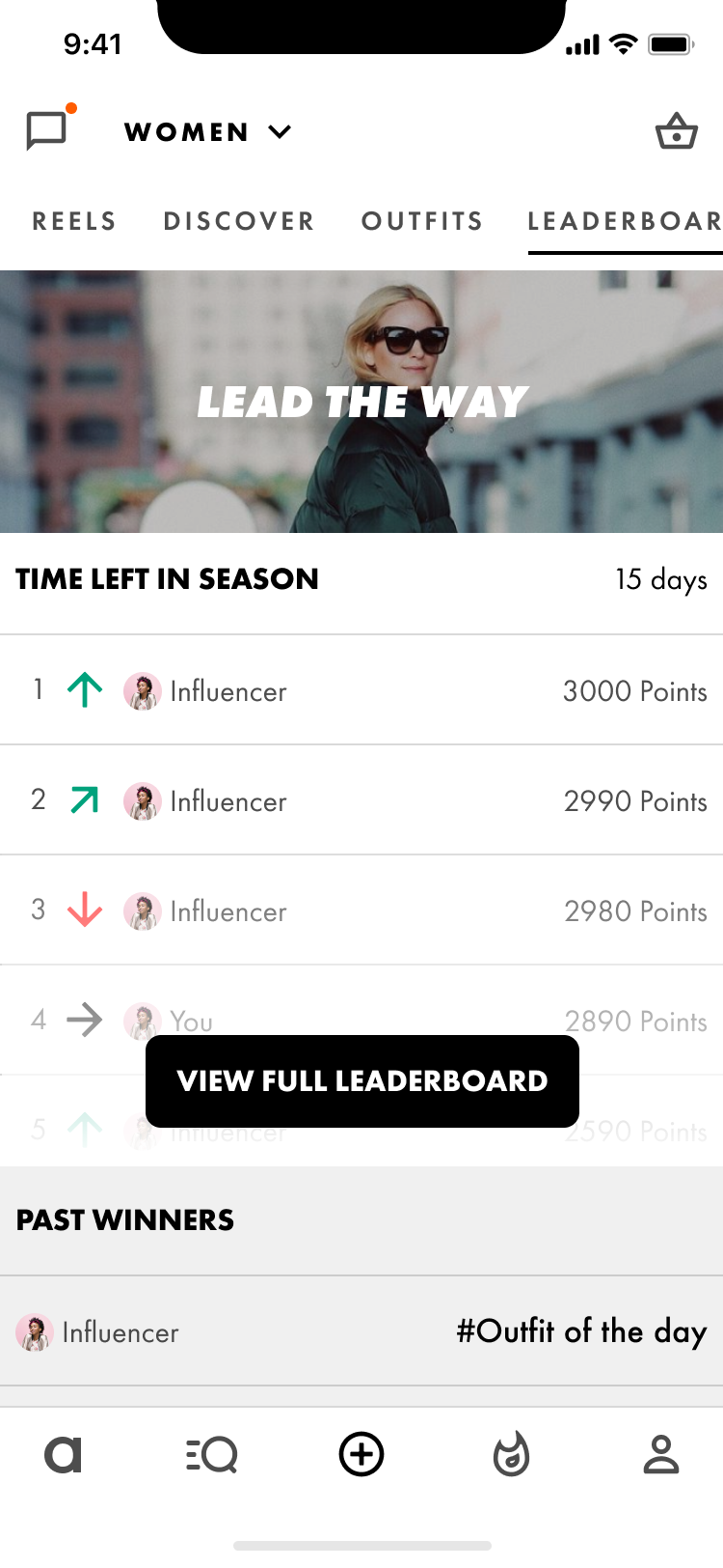
Leaderboards, badges, milestones, unpredictability, points, and challenges all work together to engage users and make using the app more addictive and sometimes more enjoyable.
Hooked model
Principles such as prompting/nudging, unpredictable rewards, and asking users to invest their time and effort in the product all work together to create a repeat user cycle and increase engagement over time.
Out of the principles of persuasion listed above, I came up with a series of features.
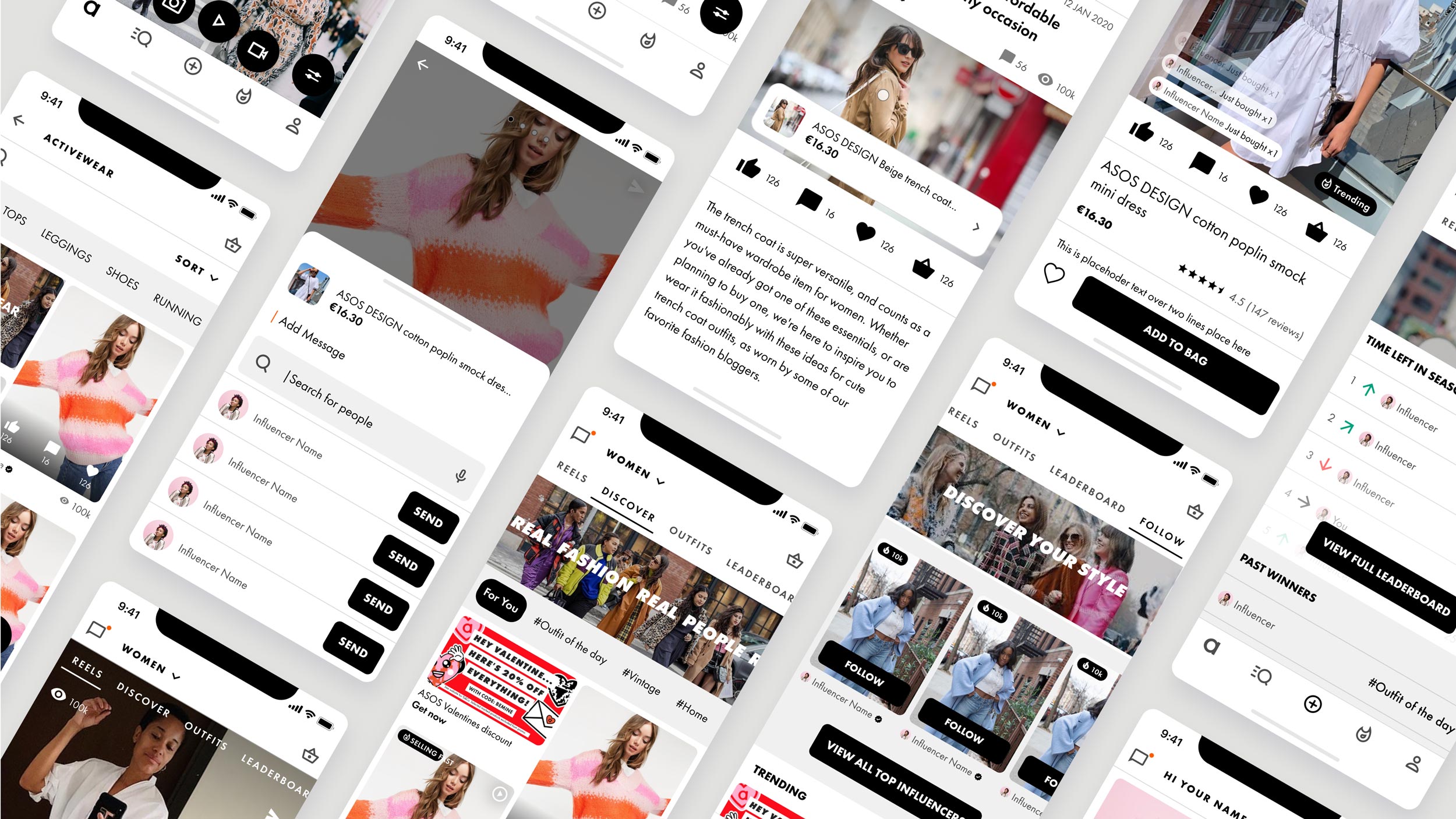
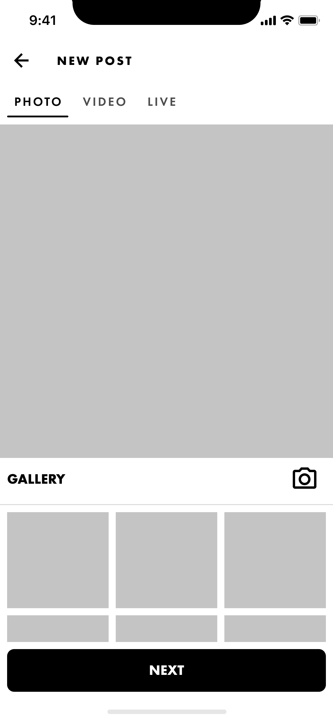
New core feature user journey for the asos mobile app.
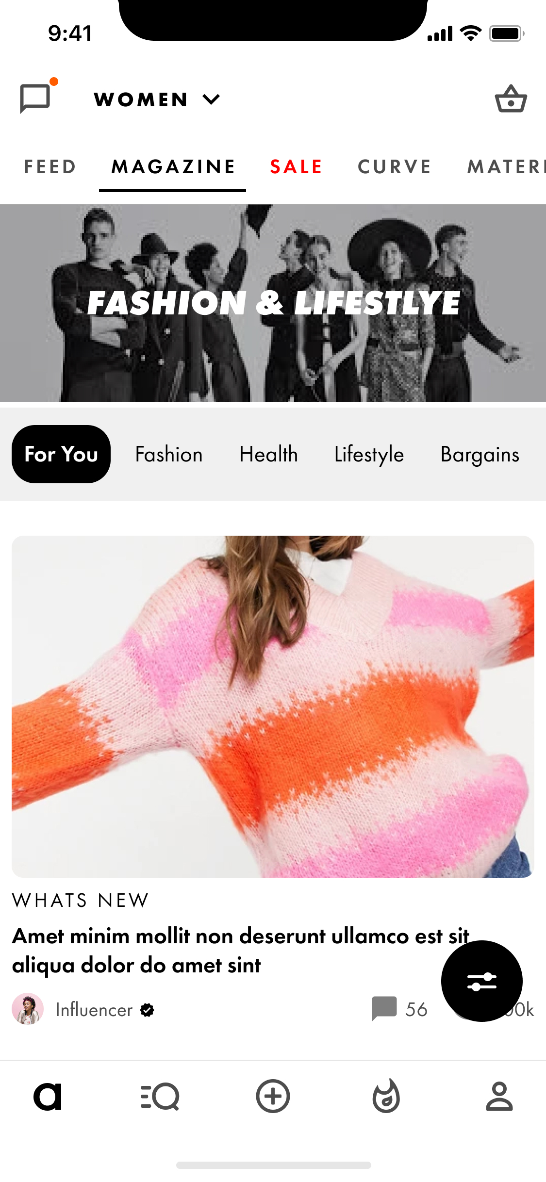
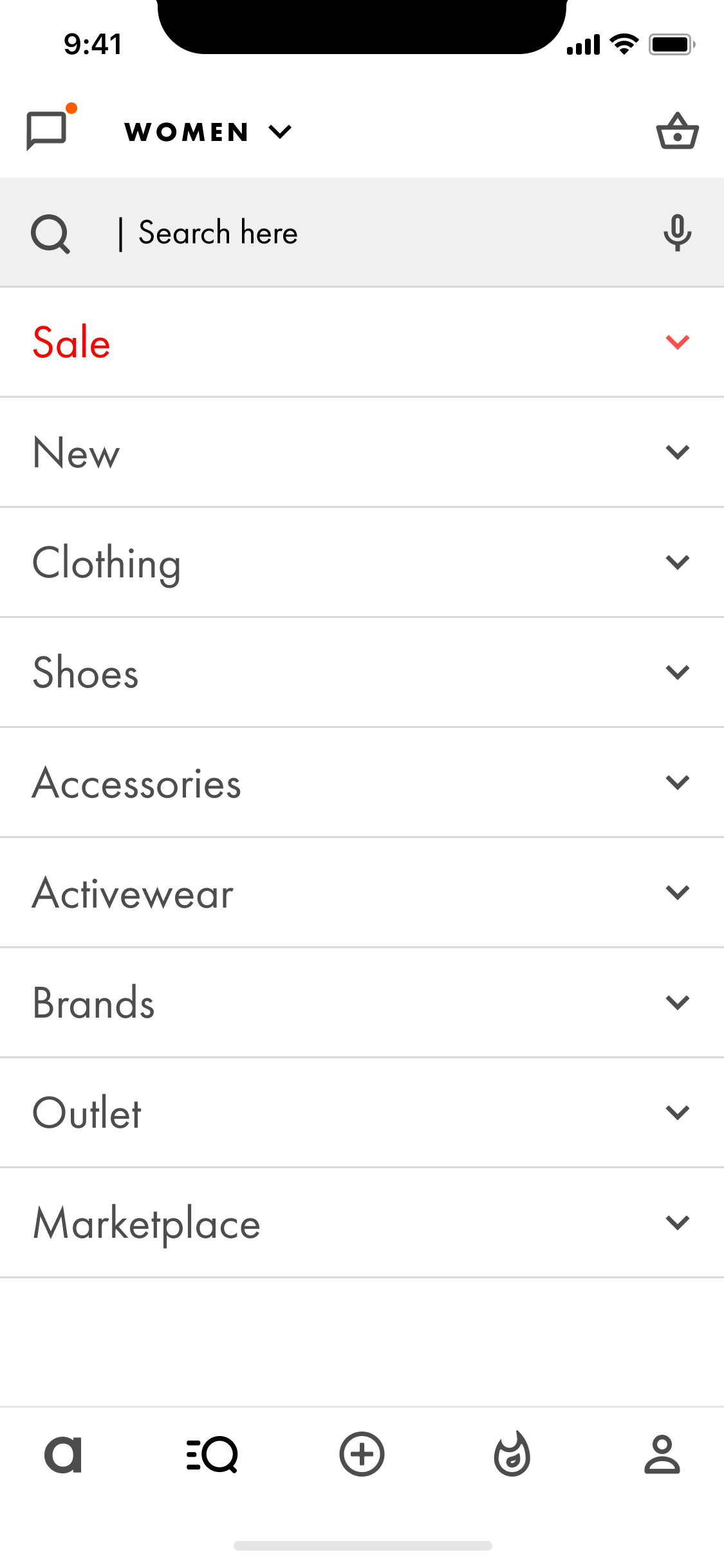
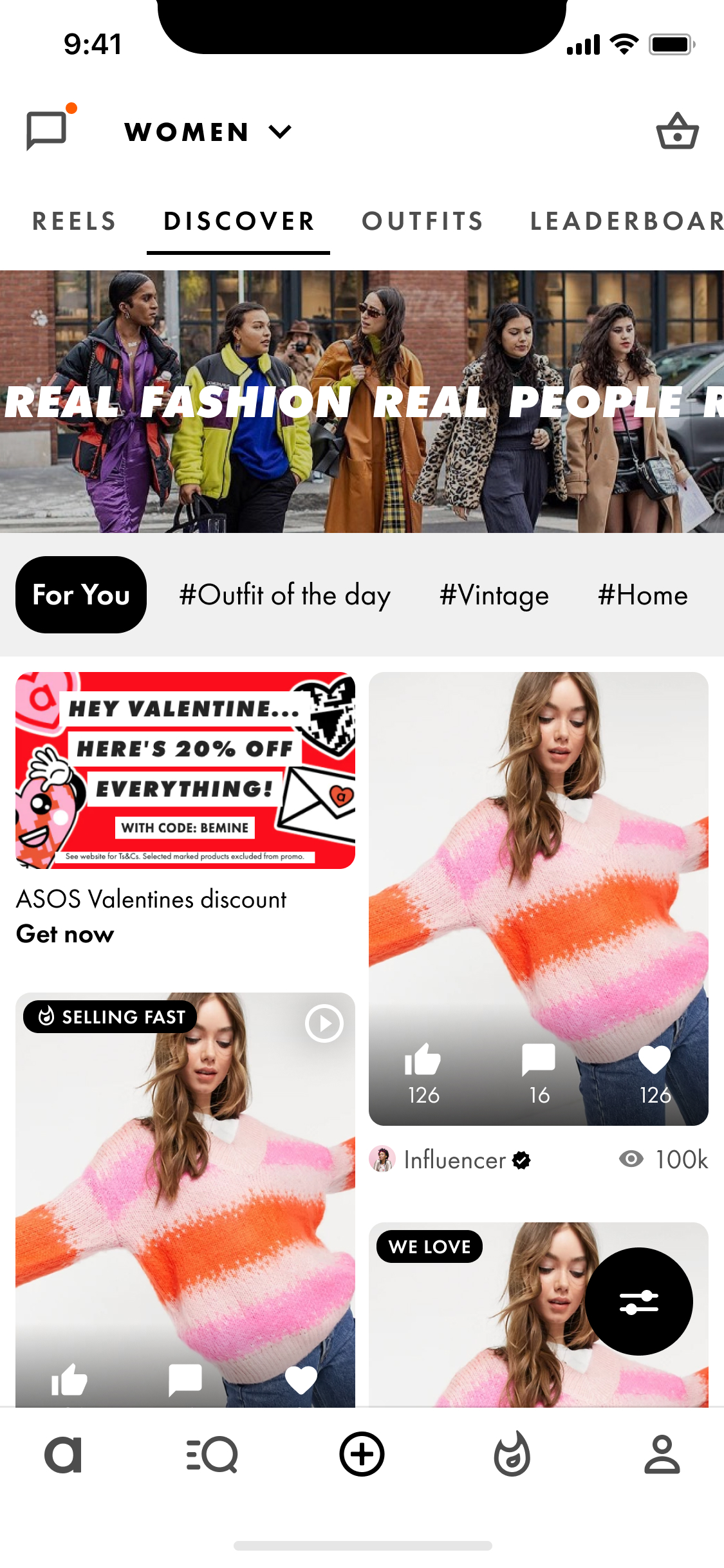
The core structure of the app remained much the same. However, there were new sections added that contained an abundance of features. These included a explore page, posts page, trending page, notifications and chat, feed and magazine. The e-commerce flow was untouched as the redesign focused on user behaviour before the decision to purchase.
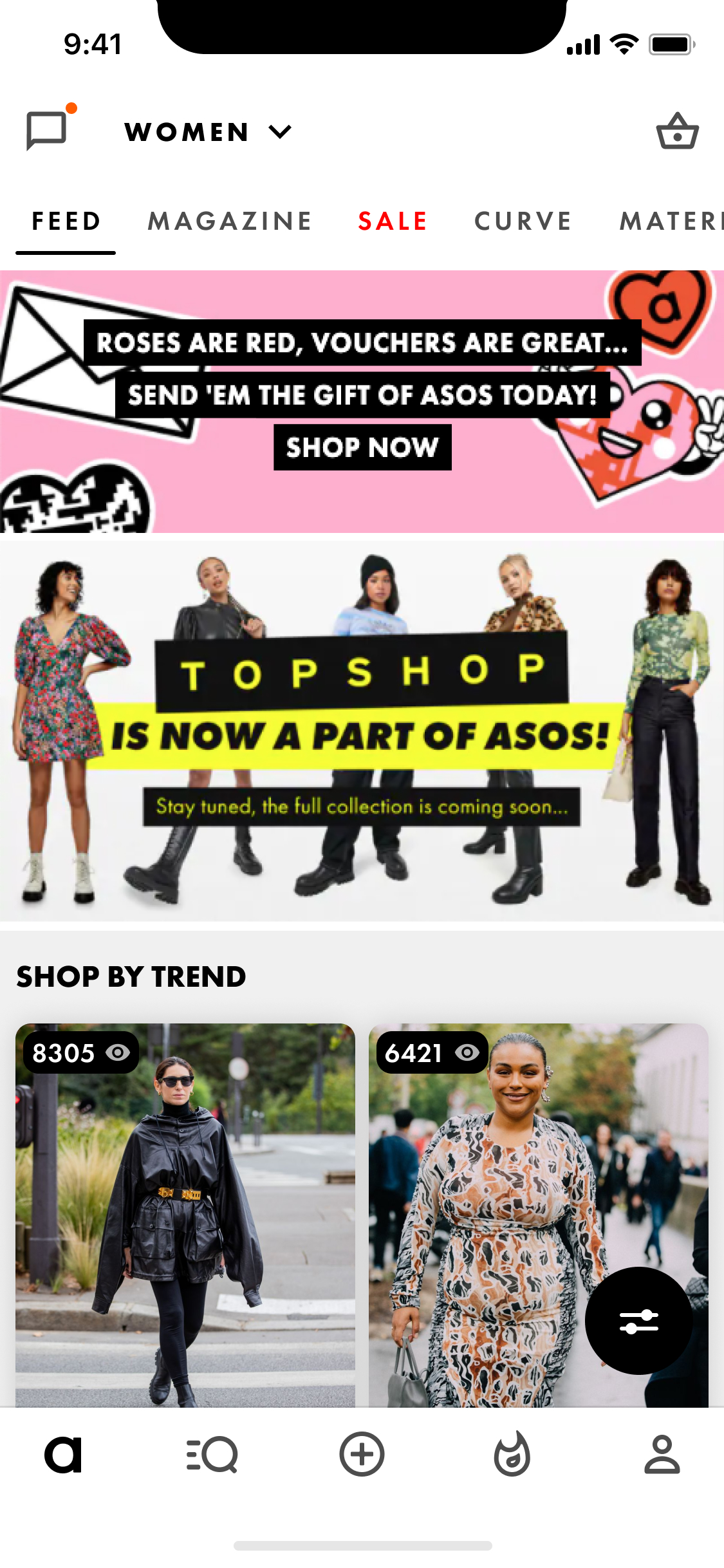
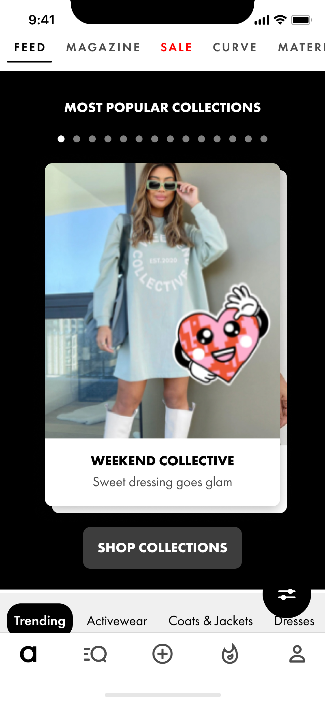
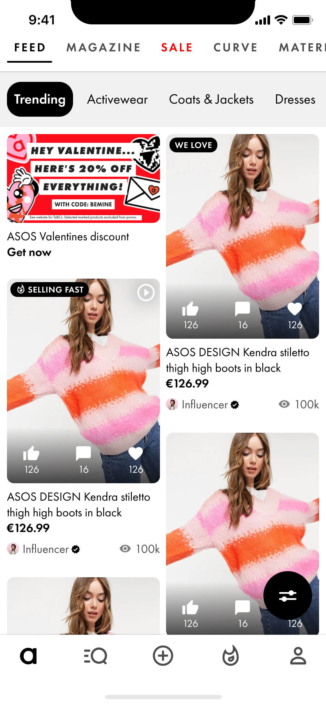
The Asos design system is used in the redesign, so the focus is on the new features only, not the UI. The home screen features an endless scroll, interjected by opportunities to shop by trend or collections.
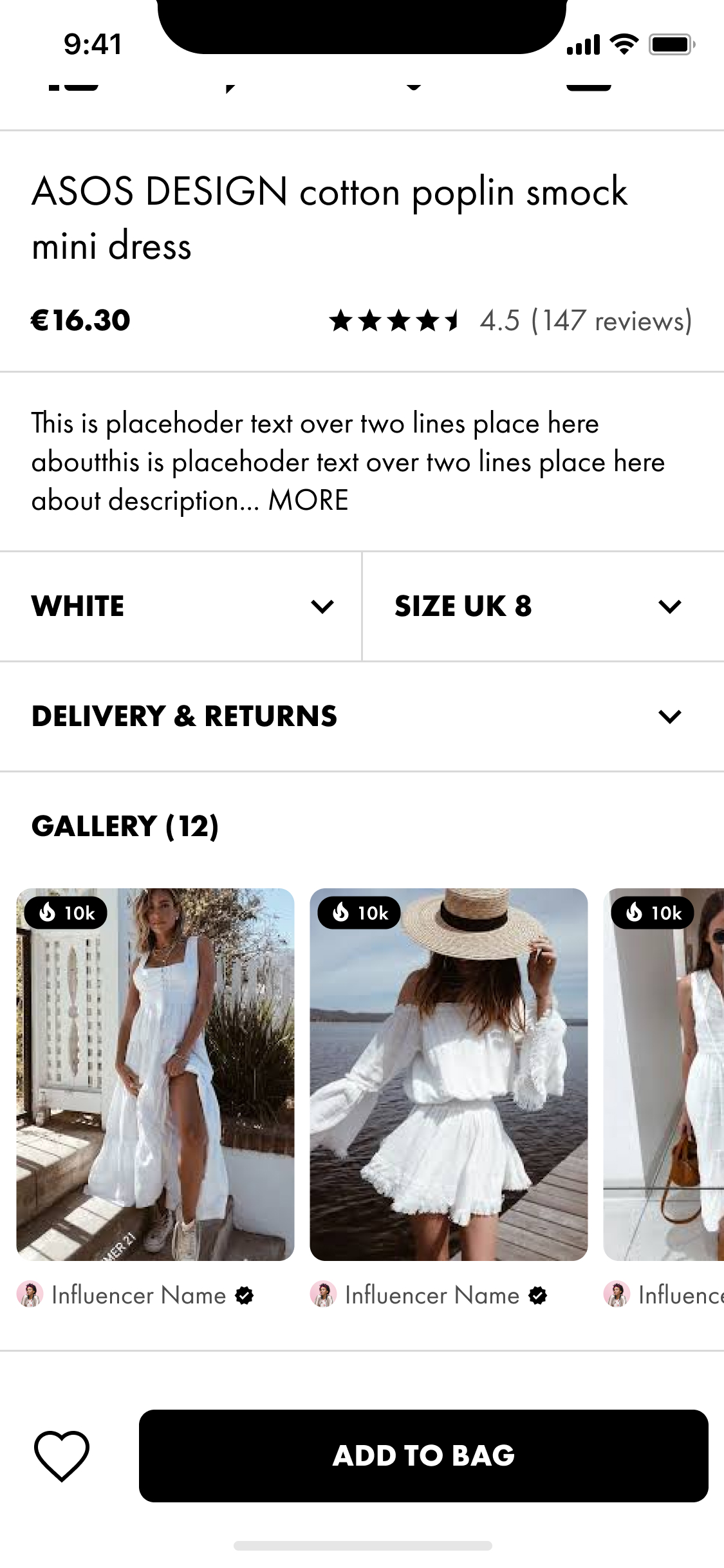
The magazine has a collection of fashion articles, where users can look to the experts for inspiration for their next purchase.
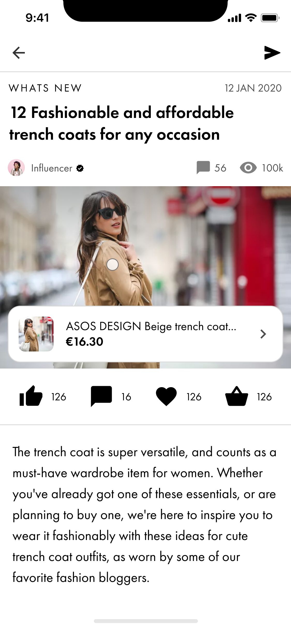
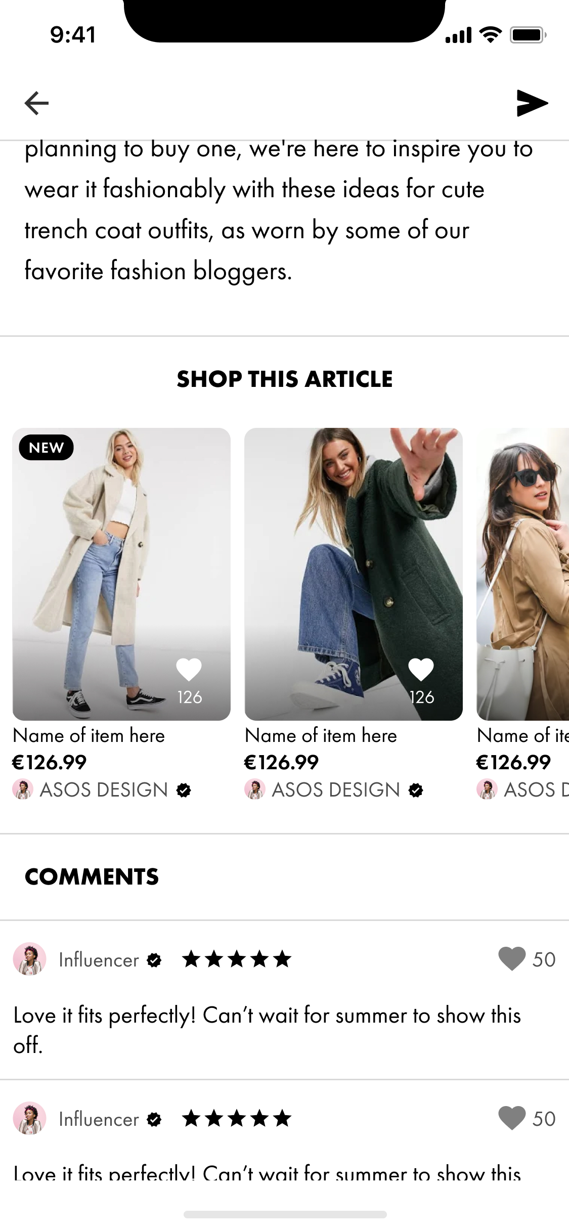
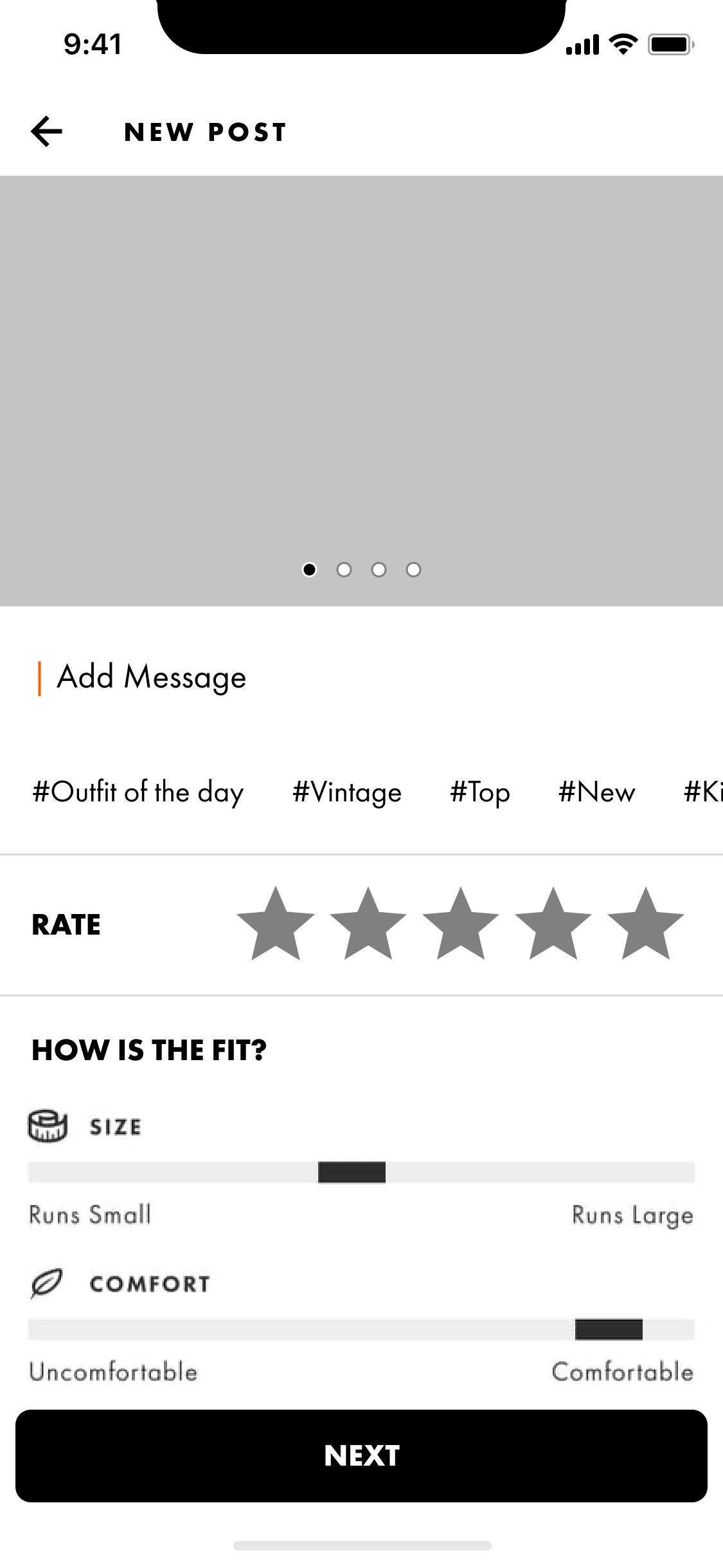
Product pages have a large carousel at the top, followed by details on the item, a gallery of other users pictured with the item, and user reviews. The page has no bottom and enters a bottomless scroll of related items.
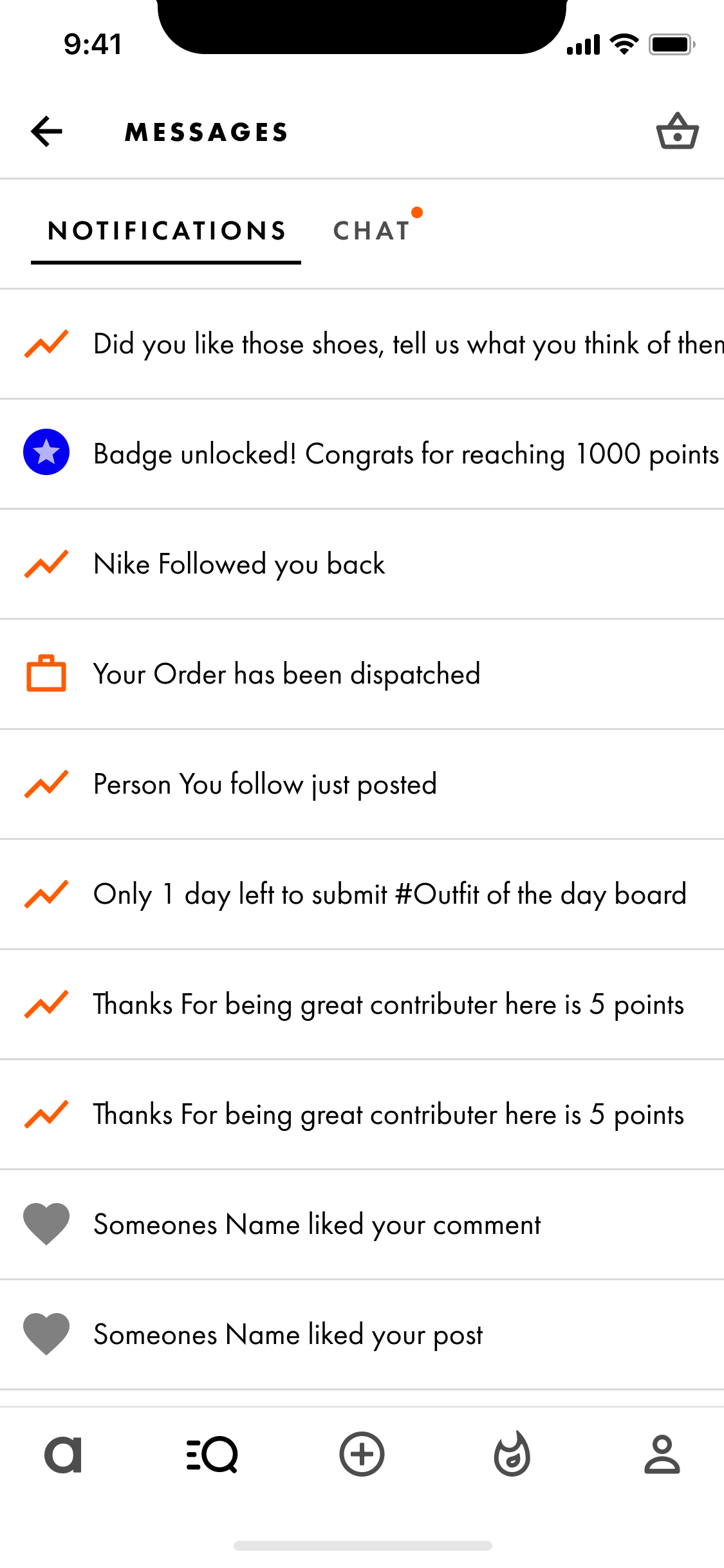
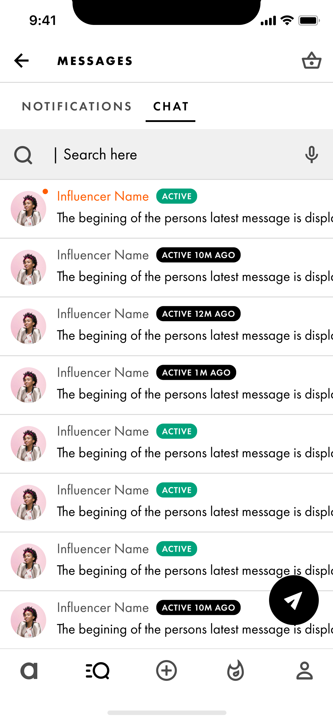
Chat and notifications are used as a prompt to get users to use the app, and to allow users to connect with one another.
Social elements such as leaderboards, competitions and alternate browsing styles such as reels are all designed to boost user engagement and time spent on the app.
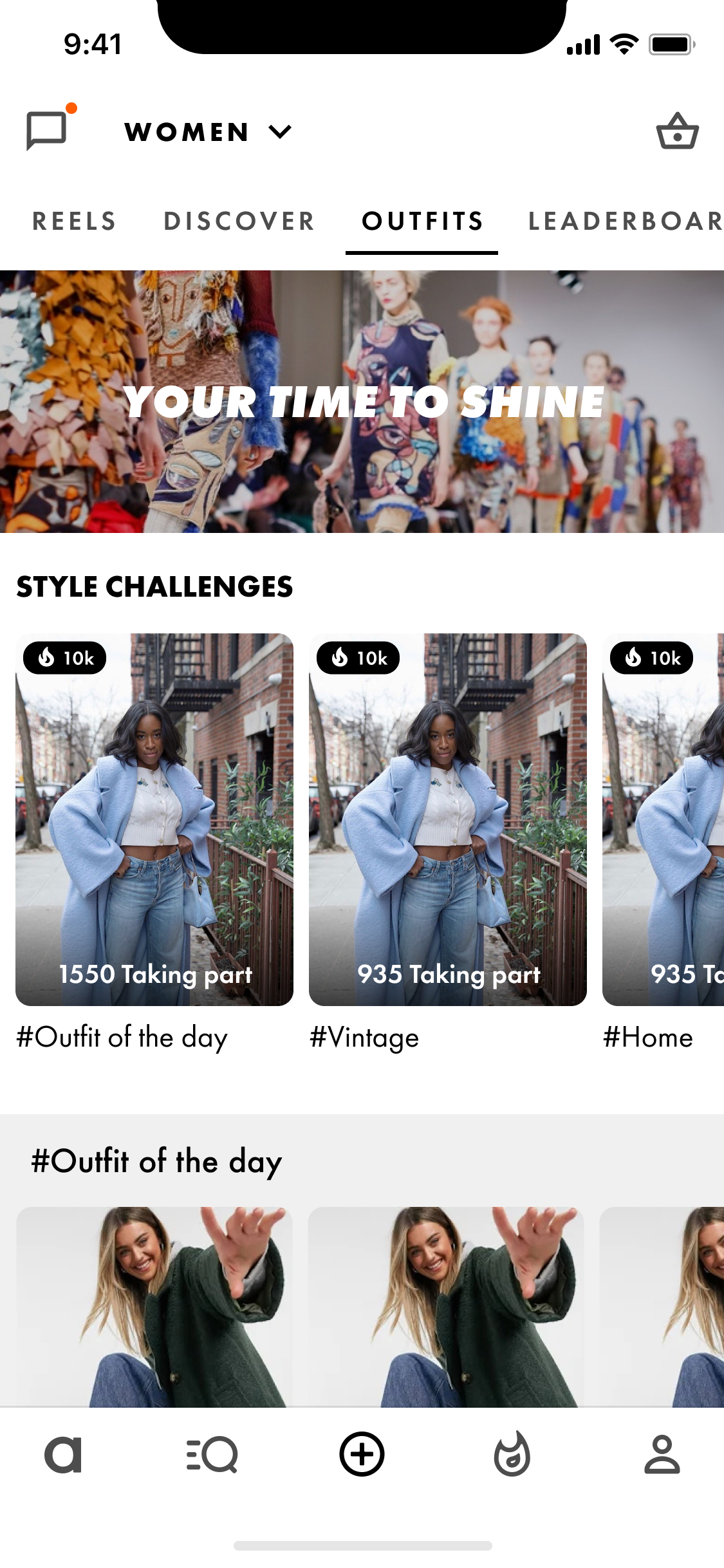
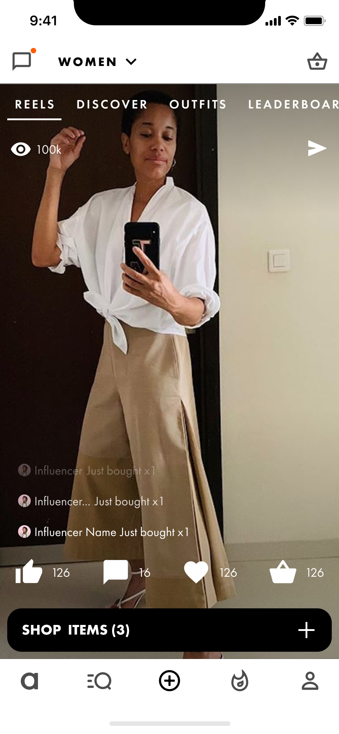
Users can follow one another, partake in leaderboards, and post reviews, and collect items into themed boards or collections. Points and badges are awarded for engagement which could ultimatley be cahsed in for nominal discounts.
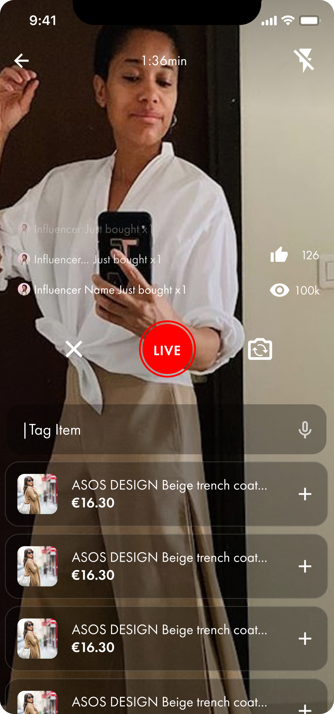
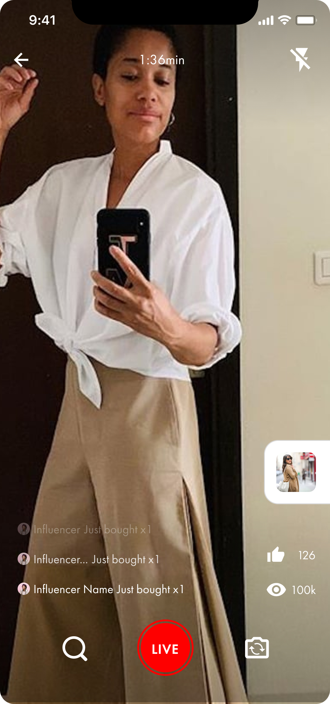
Users can post content in three formats, photos, videos, or live reels. A shortcut popout to either of these pops up when users tap the plus icon in the bottom navbar.
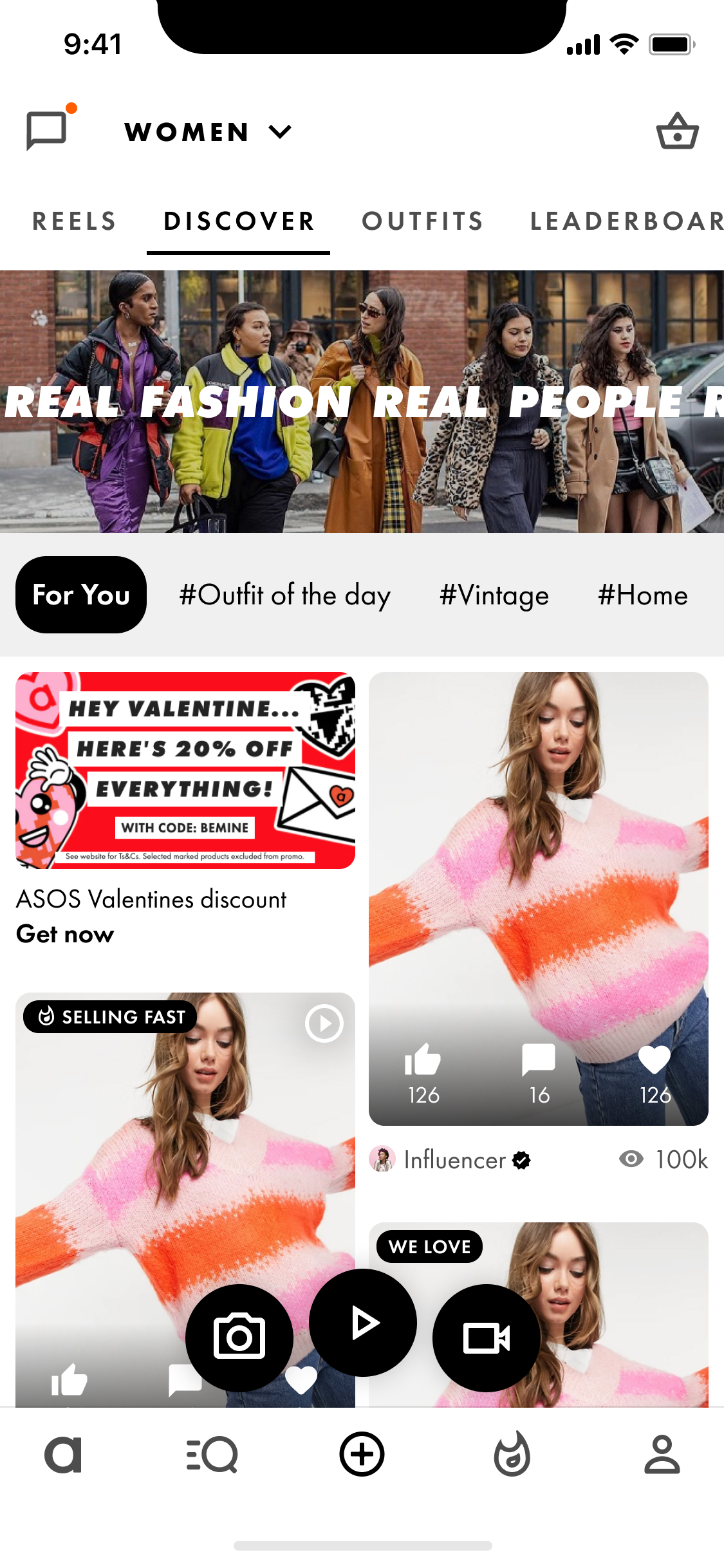
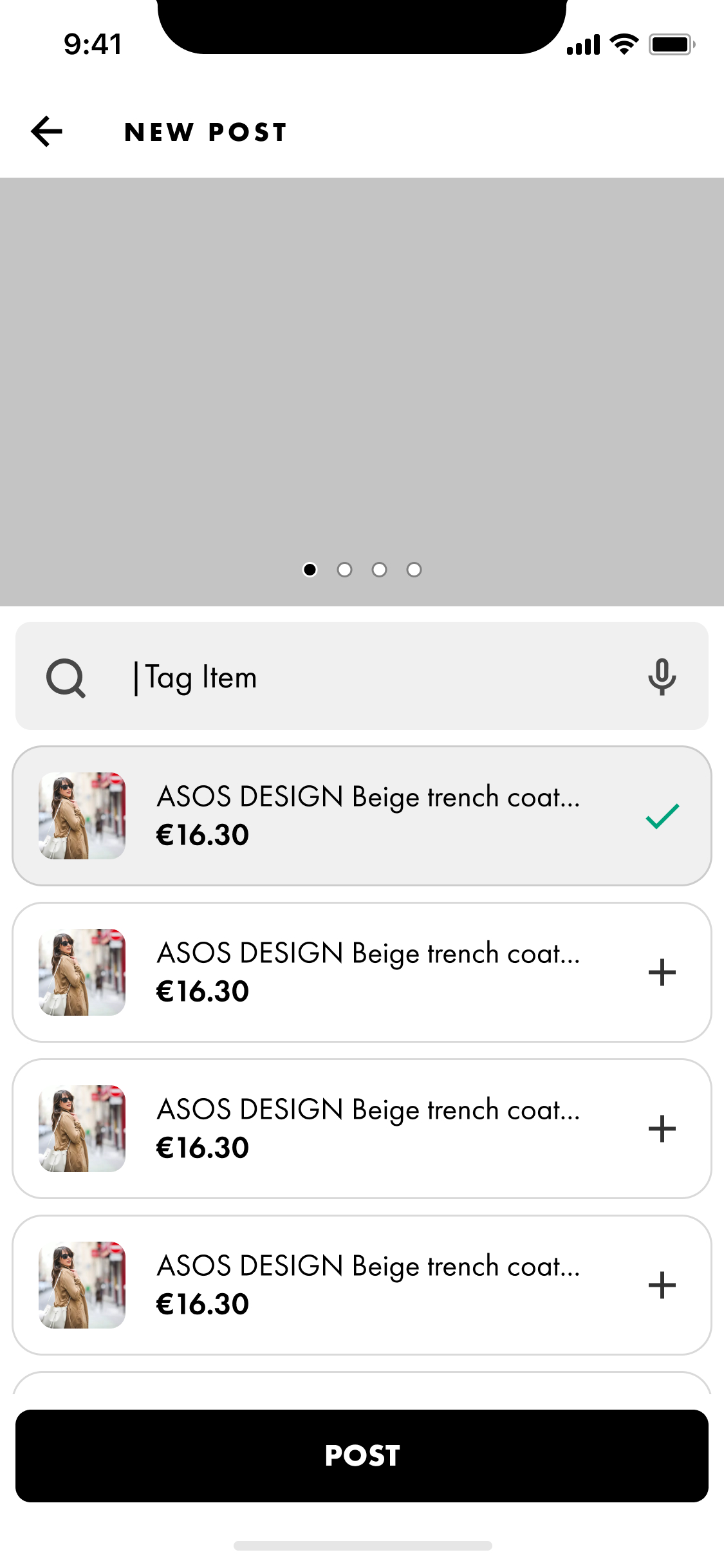
As users live stream content they can easily tag items that feature in the video.

The prototype itself is limited and acts more of a way of navigating between screens.