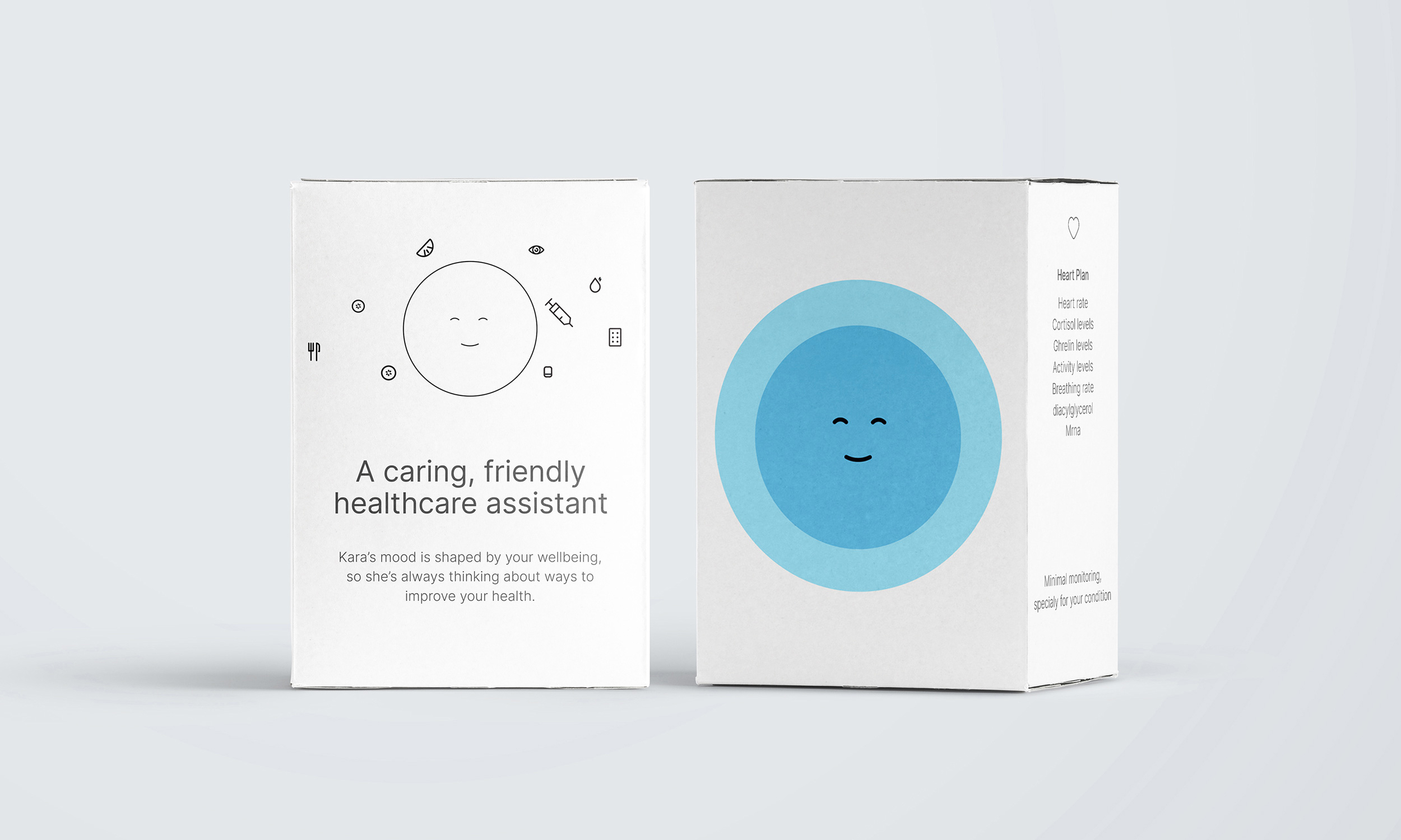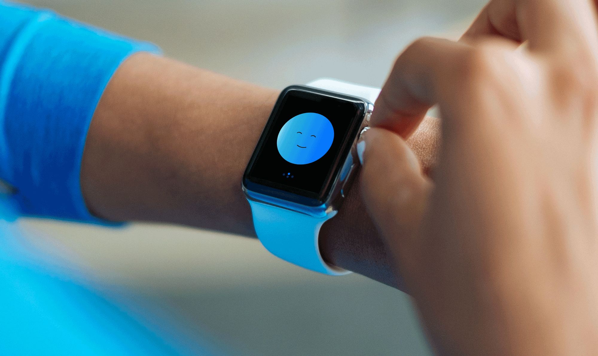

Kara healthcare is a design concept completed for my Visual communications graduation show. The project speculates that advancements in health monitoring technology could allow for widespread use of mobile devices to accurately monitor and provide care advice to patients living with long term health conditions.
The challenge was to design a whole new way of interacting with this technology to live fuller, happier lives without dealing with detailed data.
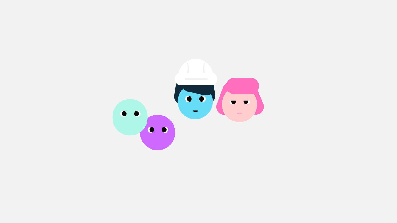
There were ethical issues with me conducting in- depth research with people living with medical conditions as a student. However, I did have the opportunity to talk to a range of friends and family who have long-term health conditions. From that, I generated a series of proto-personas representing some of the experiences of the people that I managed to interview.
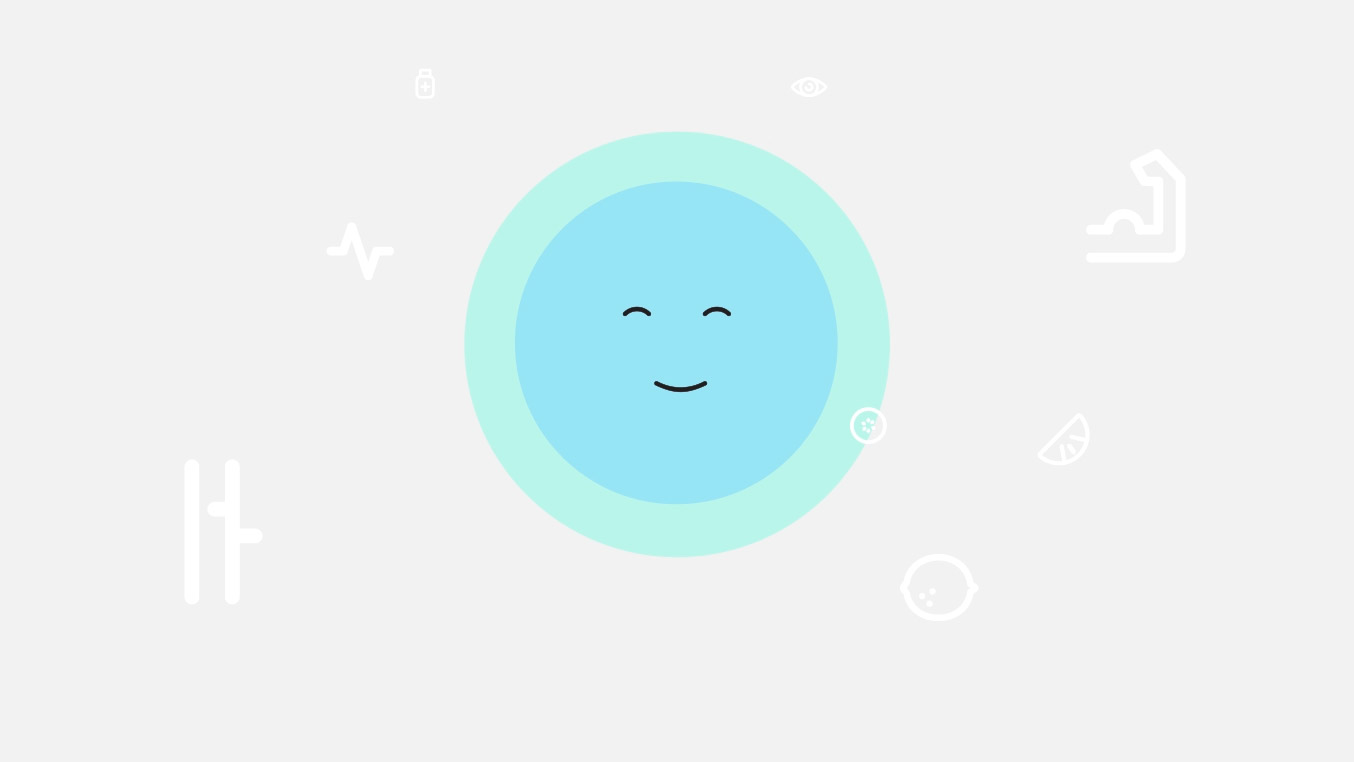
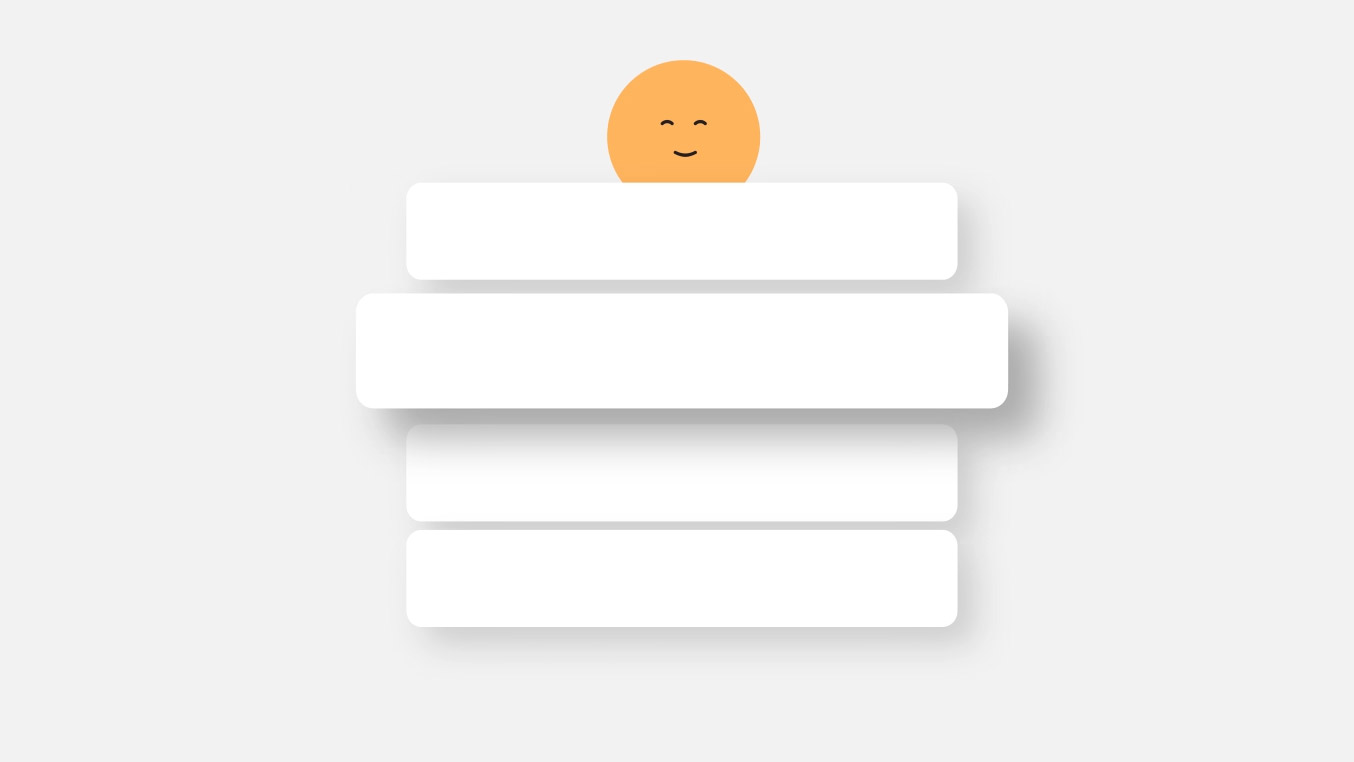
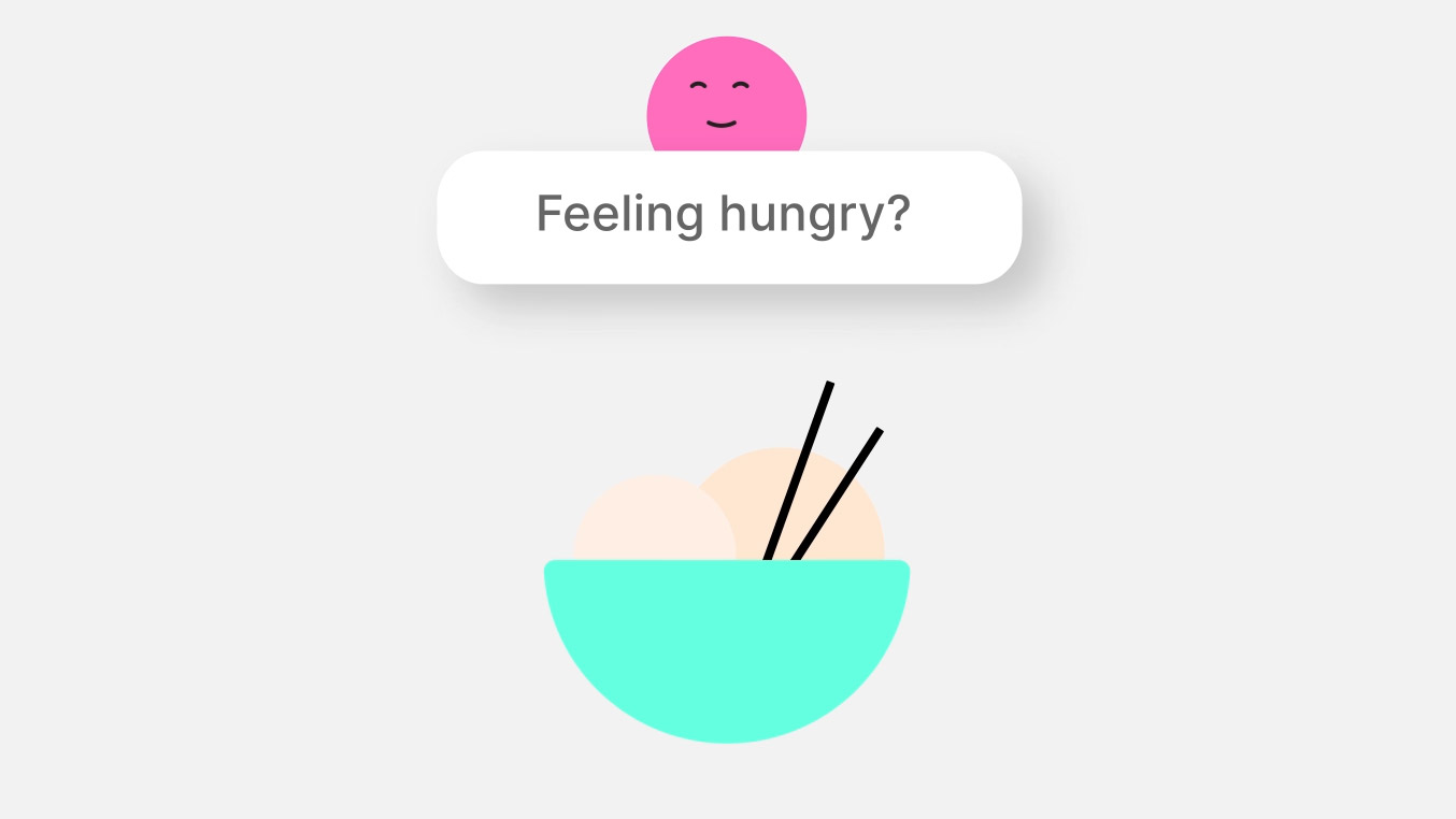
Kara processes your data in real-time and provides gentle care suggestions throughout the day through the form of pop up notifications. The experience is kept simple and effortless, with most interactions coming through the Kara character.
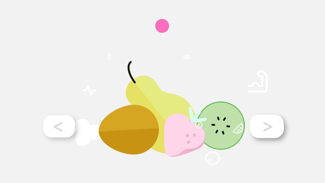
For more confident users, there are side screens where they can review what data Kara is monitoring, check their care plan, as well as edit their own medical profile. In the event of an emergency, Kara displays your emergency details and can alert emergency services.
The design was kept minimal and simple, taking inspiration from Japanese Kuwaii cuteness culture to ensure a friendly and caring appearance. The design was also influenced by research that more minimal and simpler designs are perceived as easier to understand and less intimidating to users.
Kara is an AI character that represents a patients health and provides care advice depending on their condition. Throughout the project, various character versions were tested with participants, using ad-hock recruitment, to see their reactions and refine the design so that the AI appeared unintimidating and friendly.
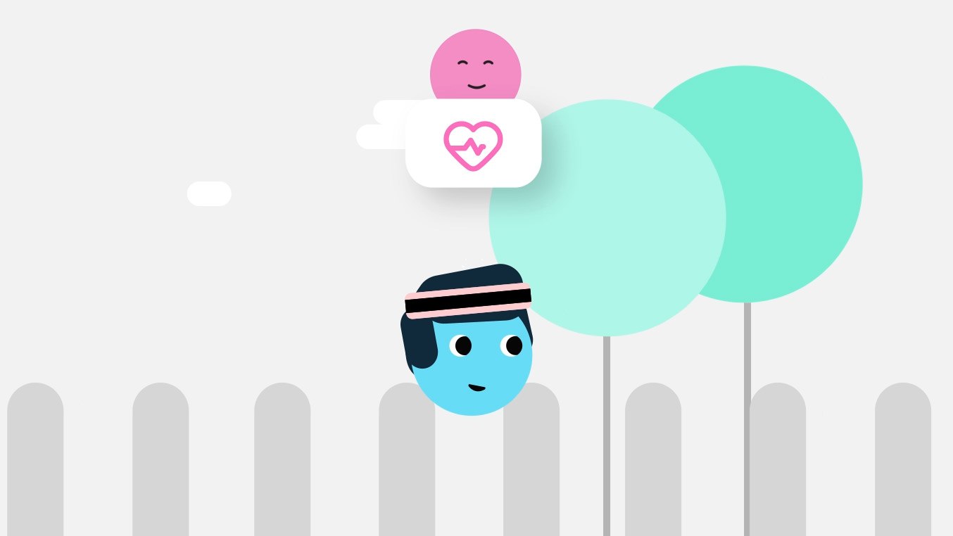
I designed and animated an explainer video to explain the concept of Kara and how it works. I was paired up with a sound design student to record the script I wrote and create music and foley for the animation.
The speak aloud method was used during testing, and users were reasured that the prototype was not a final design, and not to worry if they got stuck, and to explain why they were having trouble. After testing, we asked participants for any closing comments or suggestions they may have had for the design.
